More Attempts at portraits

JKnobelock

TPF Noob!
Joined
Nov 20, 2008
Messages
142
Reaction score
0
Location
St.Peters, Missouri
Can others edit my Photos
Photos OK to edit
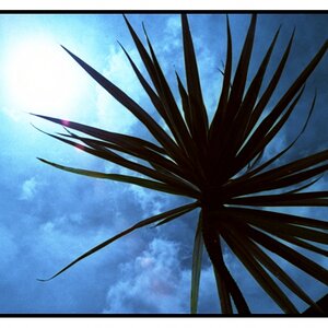
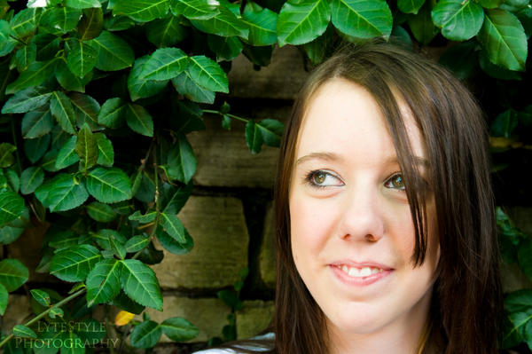
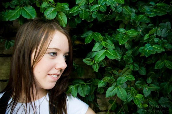
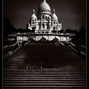
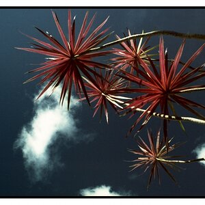
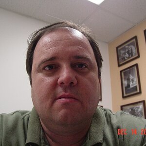
So here are some more attempts at portrait photography. let me know what ya think!
1.
megan_1_5_by_LytestylePhotography.jpg

2.
Megan_1_4_by_LytestylePhotography.jpg

3.
megan_1_1_by_LytestylePhotography.jpg

4.
megan_1_2_by_LytestylePhotography.jpg
 
#3 is the only one that clicks, the framing and composition are nice.

#1 is a hair underexposed, but not bad. this would have been nice had she been "looking past you" to get her eyes off the lens.

she looks intimidated/uncomfortable in #2 and the composition is awkward as well.

#4 isn't far off, but the pose is to "posed" something a little more natural would be nice. i like the exposure of this one though, but i feel like there is a too much distraction above her head with the window frame.
 
Try #3 again, but move the shot down a bit. It is OK to cut off the top of the head a little, but you don't want to get so close to their chin.
 
I like #3 the most. I am just now starting to learn about lighting, but the lighting on it seems the best.

Did you using any flash whenever you took these photos?
 
thanks for the critique guys. I definately agree that three is the best, although 1 is one of my favorites too... as far as lighting goes, its all natural, I think im gonna start playing with a fill flash next.
 
A fill flash is a good idea. It will get rid of unsightly lines and shadows under the eyes like in the first shot. (BTW, you can remove those in post.)
 
Number 3 is my favourite but the hair straggling over her eye is a distraction.
Number 4 is a no-no - always told to avoid the "up nose" shots as they are most unflattering.
 
#1 is ok. Her expression is a bit annoyed and the hair over her eyes is distracting. The overall picture seems a tad under exposed, specially in the top left corner, making her hair blend into the background

#2 is a bit scary. Seems like she was forced into a corner. Probably due to the square shoulders. I think the wood OR the brick would work as fun backgrounds, but not both together. But remember, photography is all about experimenting with different things, so congrats with trying something different out.

#3 is the best. Nice and close on her face, she is looking towards the other side of the picture, you got the eyes nice and in focus. I think her look is a bit too far to the side and as said, the hair over the eye is distracting. I also like how the foliage kinda frames her

#4 nice attempt, but as said, I'm not a fan of up nose shots. There is also some empty space over her head. Maybe having her tilt her head down a bit and look at the camera, moving her hand to the side of her face might work.

Good job overall...keep those attempts coming!
 
thanks for the critique guys. I definately agree that three is the best, although 1 is one of my favorites too... as far as lighting goes, its all natural, I think im gonna start playing with a fill flash next.

don't forget about reflectors, they can be much softer and more "natural" than fill flash, especially when shooting outdoors. it will keep your color temps the same versus the white light from the flash (unless you use gels).
 
thanks again for the critique,I find that i seem to do best with my headshots, I have a little more issues placing the body, but i will say i have a lot of fun working through this, and luckily I have friends who dont mind working with me. I will definately be looking into getting some reflectors, as i allready have a flash i can use.
 
I like #3 the best for both lighting and composition. :)
 
#3 may be the "best" of the bunch, but they're all pretty bad.

Actually, #1, if you moved her hair out of her eye would probably be the best in terms of composition. It's a pretty basic portrait pose. Lighting could be better.

#4 is an unflattering shot of her nostrils.
 

Most reactions

Back
Top