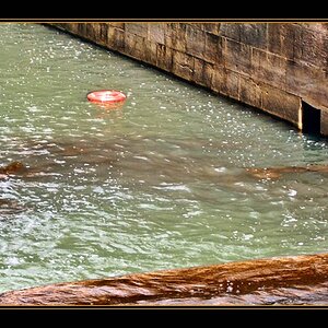
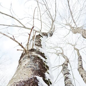
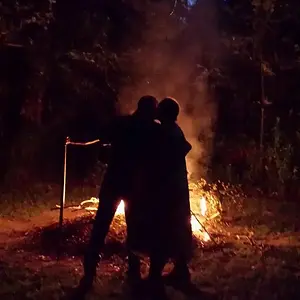
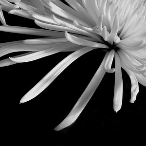
2 is really nice. A very nice, touching moment there. The composition on 3 is ok, though I'm developing a bit of an aversion to dead-centering things. Their expression and pose is nice, though. (same comments as DC about the blown out highlights)
On 1 there is a lot of dead space in the shot, particularly above their heads. I would crop it differently. Maybe off to the side and up a bit.
1 and 2 both seem kind of washed out, though in 2 it looks more like a style choice and I think you could get away with it.