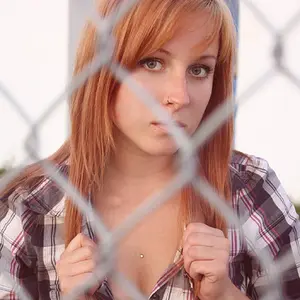
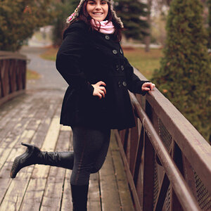
I don't like the cut off at the knee. I think it should either be full portrait or cut off higher - for example, in the first photo, just below her fingers and in the second one below the hem of the model's shorts.
There are quite a lot of shades in the background and the model is wearing three different colours which makes for a busy photo and perhaps the model blends a bit into the background?
You chose a pretty model, the lighting looks fine on my screen and the setting is very pretty :thumbup: