Ms. Jessica Jade

Project 6

TPF Noob!
Joined
Jan 13, 2009
Messages
66
Reaction score
2
Location
NJ
Can others edit my Photos
Photos NOT OK to edit
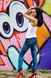
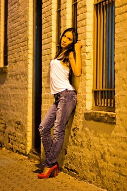
Hey guys! It's been quite a while since I've been on the forums. That doesn't mean I've stepped away from photography though. Actually since my last post I've upgraded my camera, and dove full force into photography. Actually today I just started my new job as a studio portrait photographer. Anywayyyyyy...thought I'd share some shots I did of a friend last october. C&C's are extremely welcome...it's the only way you keep learning. Thanks.

View attachment 4515View attachment 4516View attachment 4517View attachment 4518View attachment 4519View attachment 4520 $RedHeels.jpg$Pose2.jpg
 

Attachments

  • $GettingFocused2.jpg
    $GettingFocused2.jpg
    1,012.8 KB · Views: 129
  • $GettingFocused.jpg
    $GettingFocused.jpg
    1.2 MB · Views: 148
  • $Fun.jpg
    $Fun.jpg
    1.7 MB · Views: 161
  • $Alley3.jpg
    $Alley3.jpg
    1.9 MB · Views: 123
  • $Alley2.jpg
    $Alley2.jpg
    2 MB · Views: 114
  • $Nike.jpg
    $Nike.jpg
    1.4 MB · Views: 145
IMO, generally terrific with the Nike shot my favorite.
A couple have some underexposure issues (redheels and gettingfocussed) but every single one is pretty nice.

Good luck on your job and keep this model.

Lew
 
There are a couple here that I really like, a few with potential, and a few non-starters for me.

- My favorites are numbers 2 and 8. Oddly, both of these work despite (or even because) the model is square to the camera. Generally this is not a particularly flattering pose and is not recommended.
--In #2, I like her pose, the use of the landscape orientation with this pose, and your perspective on her. Having the torso square to the camera is regarded as a more masculine pose which is appropriate for a fitness shot such as this. Despite the cloudy day you've got some great shadowing on her physique. I do wish that it had been shot just a tad wider. I like the amount of headroom you have, but her right arm is cropped right at her elbow and her left arm is cropped almost at her shoulder. I also kind of wish that you had either captured more of the skyline (not higher in the frame, but more horizontally, along the bottom edge) or not had any buildings in the background.
--In #8, I like the horizontal symmetry with her and the illustration each a bit off center. Even though she is square to the camera the positions of her left leg and arm give the pose some interest, and since she is clearly leaning back against the wall she doesn't appear too stiff. I like how the blue and white of her jeans and top match the palette of the surroundings while her skin and shoes pop.

-I think shots 3 and 4, the stretching shots, have potential. They are each tilted a bit (see the buildings in the background) which I don't like unless it adds to the image, which it doesn't here. The blue shot could have been more dynamic had you shot her from a slight angle, up to a 3/4 perspective, rather than side on. I would have liked to see her not looking at the camera (this looks like a pose, if she weren't looking at you it would look like a stretch), and have the knee of her bent leg just off the ground (again, to appear as if stretching rather than a static pose). In the sepia shot I recommend either shooting vertically or wider so that you get her plant leg in the shot. In both of these I would recompose/crop so that she is not centered. Put her to one side, looking into the frame, and you have a much more dynamic image.

- Shots 5 and 7 are okay. In both of these she is not square to the camera (good). In #5 the background is way too busy and beats her for your attention. I also wish the bottom of the frame wasn't right at her shoes - leave a bit of foreground for context and she appears more grounded. In #7 I'm having a hard time getting past the yellow color cast (I'm sure caused by the ambient lighting, and I can see points for keeping it, but on the white shirt and her skin it just looks wrong to me). I like her pose, but here again she is centered horizontally and vertically (bad).

- The other two shots (1 and 6) do nothing for me. She is standing square to the camera with her hands in her pockets, a very uninteresting pose. Particularly in #1 she is too small in the frame to really command attention versus the background yet is just large enough that neither of these pass (to me) for an environmental shot which she happens to be in.

Just my opinion, take it as you will...
 
Thanks Rob for the opinion. I totally see what you were saying in each one. Every bit of C&C is always welcome.
 
The Nike shot is my favorite but only because the image of her stretching with the cut off leg lacks the full body. I think if you had captured her full body in the image with the city as a backdrop, the image would be killer.
 
Is this jersey city? I recognize that skyline ;) Good shots but the processing varies a lot between these.
 
Shots are okay but couple things. There is not really much consistency going on here. Seems like scattered ideas. Plus she does not seem comfortable in a lot of the shots. You were starting to get on to something with the last two. But there is a white balance issue with some where you are getting heavy yellow overtones from the street lighting. I know this is natural for those kinds of lights but it makes skin look horrible and you lose detail. There is also clipping of appendages in a few shots and she has the dead arm happening in some too. Prevent dead arm at all costs!
 
Pictures with the Skyline in the background is Hoboken. The Cobbled roads is Jersey City, and the Alley is Montclair.
 
I love the stretch in number 4. She creates a nice, consistent diagonal that flow from the extension of each leg. There is something disturbing about the edges of the buildings... it's almost like the sky was edited out.
 

Most reactions

New Topics

Back
Top