Oh thank god. I thought this was going to be your take on Dali's "Hitler Masturbating."
Anywho,
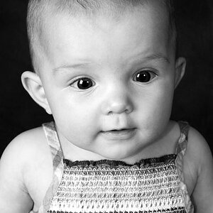
It's rather plain, and not in an understated way, but a boring one. I find the blown highlight on the back and shadows on the wall rather distracting. The tone range is definitely too compressed...it goes from pure black to pure gray to pure white. It's not a terrible attempt, but there's a lot of room for improvement.
Myalover is naturally drawn to self-portraits, which she knows all too well.
I say give it another go and try for a smoother tone range and a composition that isn't quite so straight-forward.
I'm going to agree with MyaLover here. The blown highlights don't bother me (and probably wouldn't cross the minds of the vast majority of non-photographers). I actually really like the contrast here. I'd rather see black and whites dominate a picture than have a plethora of grayscale midtones.
Also, I like how it's simple and still makes for a good self-portrait that I'm assuming has meaning for you.
not a pro but I really like it and agree with the others except on the shadows on the wall. I wouldn't get rid of them all together but I would tone them down a hair more.