My Favorite Place. B&W C&C

sm4him

In memoriam
Supporting Member
Joined
Oct 4, 2011
Messages
10,726
Reaction score
5,467
Location
The Beautiful Hills of East Tennessee
Website
sm4him.500px.com
Can others edit my Photos
Photos OK to edit
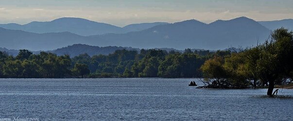
This is the landscape at one of my favorite local spots for birding. During the summer, the lake levels are so high, I can't even get to the spot to take this photo, but now that the lake levels are coming down, the road can be accessed again. This was taken just this past Saturday; I'll be back out there on Friday (I hope), and my bet is that the water will be quite a bit lower already. By late fall/early winter, if I took a picture of the same spot, you'd see no water at all.

Anyway...I'm not very good at B&W, but I'd like to work on it a little.
So I'd love some opinions on this, and/or suggestions on conversion techniques. As I said, I hope to be back out there on Friday, so I may take another shot at this, though the likelihood of getting one boat in the water like that is slim, and that's part of what I like about this photo. I have one from the exact same spot on the same day without the boat, but I prefer this one.

1. Original color version--I swear I straightened the horizon, but now it looks a bit off. Bother.


2. B&W conversion. All I did to convert was chose Adjustments--Black & White (in PS), then moved the sliders around until it seemed I got something that seemed okay.


I have some opinions about how the B&W turned out, but I'll wait and see what others say first.
 
Just for fun: Here's a shot of the same basic area last March, just as TVA started raising the water levels. I was standing considerably further to the right in this shot, plus it's a wider angle, but you can get the basic idea. That road is completely submerged right now.

 
Last edited:
I like them both, but my mind thinks the B&W is sand, and not water for the first couple of seconds.
 
I like them both, but my mind thinks the B&W is sand, and not water for the first couple of seconds.

Hmm, that's interesting, I hadn't seen that at all until you mentioned it. Even then, I have to really ponder it, but that's probably because I *know* it's water, so all I *see* is water.

Thanks for the comment! Anyone else?
 
Perhaps a bit more density to the clouds and trees...bring out some detail and straighten the horizon line.

$9818342714_392cc80de2_o.jpg
 
The water does look a little like sand. You could darken it selectively in PS later (levels or curves so you don't kill the highlights) if you want it to look more like water. As for the conversion, it looks very good; my only quibble is that parts of the trees are a bit dark, so perhaps moving the green slider a little to the right? Matter of taste, I suppose.

A general comment on composition: the tree on the right because it's just a little cut off, which makes me look at it to try and see how much is cut off. I would crop more on that side, about up to the highest point on the tree, and then the tree would serve as a kind of frame on that side and direct attention back into the middle.
 
Perhaps a bit more density to the clouds and trees...bring out some detail and straighten the horizon line.

View attachment 55970


Yeah, as I said, I realized that somehow I didn't get that horizon straight. Might have been the rum, I don't know. :D
I like the way your version has brought out more detail, but on the other hand, it's also given it a darker look that I'm not loving--maybe there's an in-between spot somewhere that would work. When you say, "add a bit more density"--let's pretend for a moment I'm clueless about how to do that, and explain what you did to add more density. Not that I *need* it explained, mind you...you know, it's just for the benefit of the "newbies" that might be reading. :lmao: Yeah, I admit it--I've had PS for YEARS and still only know the most elemental things. And not even all of those. Trying to work on the PS skills this year.

Anyway...I'm actually MORE interested in whether the B&W conversion is decent and how to improve it. Although perhaps if I add density to the color and THEN convert, it would also improve the B&W contrast? I don't know.
 
The water does look a little like sand. You could darken it selectively in PS later (levels or curves so you don't kill the highlights) if you want it to look more like water. As for the conversion, it looks very good; my only quibble is that parts of the trees are a bit dark, so perhaps moving the green slider a little to the right? Matter of taste, I suppose.

A general comment on composition: the tree on the right because it's just a little cut off, which makes me look at it to try and see how much is cut off. I would crop more on that side, about up to the highest point on the tree, and then the tree would serve as a kind of frame on that side and direct attention back into the middle.


Okay, you've hit on ONE of the things I don't like about it--the trees are too dark. I tried adjusting the green slider, but because there is also some really LIGHT green, this was as far as I could take it without it starting to look kinda weird, imo. But I may play with that a bit more. I probably should have exposed better for the trees, but I was afraid that then I'd lose what little definition I had in the rolling hills behind them.

The composition: You're entirely correct. I think I actually HAVE the whole tree in the original shot--I don't even KNOW why I cut it off. I seem to recall part of my brain even thinking, "that tree is getting cut off." But for some reason, I left it like that. Again, I blame the rum. :D
If I give the B&W conversion another go at some point, I'll either include the whole tree or crop it a good bit more. Thanks for pointing that out!
 
The "horizon" actually looks fine in either version. It's slightly more organic in the "unstraightened" version, since it reads as the lake having a curving shoreline (which I suspect is true).

The tree growing out of the water certainly makes the b&w ambiguous. The boat helps to clarify the situation, but it's prominent enough to really do the work.

I feel like the blacks are excessively blocked up in the b&w. I'm not sure what the interesting thing I should start looking at is -- the tree is very dark and dramatic, but then it's blocked up and gives me no detail.

Huh. That gives me the idea that perhaps I should play into that, rather than to trying to "fix" it. Maybe I should try to make the water look even MORE like sand and leave people wondering why there is a boat with people in it on top of the sand. :lmao:
The submerged tree amuses me, but I realize that I am looking at the photo through the eyes of someone who knows the scene so well that there is no confusion. Others may see it very differently, but then, this is not exactly my best portfolio material anyway--this will end up being one of those "as long as *I'm* happy with it, it's good" kinda pictures.
I'm just not quite happy with it yet.

Can you expound a little on what you mean when you say the blacks are "excessively blocked up" in the b&w? Because I suspect that's key to what bugs me about the conversion, but I have yet to figure out what, if anything, can be done about it.
 
I like how in the B&W conversion each range is a step lighter in tone.
 
The darkest area of the tree (at least on my monitor, with the JPEG conversions in place, and so on) is a featureless area of uniform blackness. It appears almost as if someone had simply spilled ink on the screen. This is what I mean by "blocked up". So, when I look at the picture I see:

- the most dramatic visual element is this tree, let's look at it..
- ... ugh I can't see any detail, half of the tree is invisible, this cannot be the most interesting thing here, what?

which is a bit of a disappointment to my senses.

I think the idea of playing with the illusion of sand/mowed field/whatever is an excellent one. If a picture has a "problem" sometimes the best thing to do -- and almost always a good thing to attempt -- is to try to work with the problem rather than against it.
 
For me, the most interesting part(s) of this is the gradation in the hills emphasizing the arial perspective.

In the conversion, there isn't quite enough interest in the foreground to "anchor" the scene. Perhaps fiddling with exposure and contrast would improve things.
 
I like the color version best but I like blue too.
The trees really help to separate the the sky and water. Without the tress or if the trees were much lighter it wouldn't work.
Just my thoughts.
 
Density...hmmm, the easiest way is to dupe the layer, make it a soft light blend, then lower the opacity to taste. The hard way and the best way is to learn to use your shadows and highlights, brightness and contrast, exposure and color balance adjustments, then work subsequent layers using screen or multiply blends, again using your opacity slider to taste.

On this edit, I tool my edit of your color version, converted it to B&W, copied the hills and sky, duped that part on a screen blend at about 34%, then used the lasso tool to isolate some blocked up blacks, made a curves adjustment on screen blend and feathered the layer mask at about 8-10 pixels. I did this several times until I felt the blacks could hold their own against the grays and whites. I did use the exposure, highlights and shadows as well as the contrast adjustment tools.

Just remember when using the shadow/highlights tool to fist make a copy and work that so you are not "harming" the original pixels.

$9825234385_209fc85c64_o.jpg
 

Most reactions

Back
Top