jpenna
TPF Noob!
- Joined
- Jun 2, 2008
- Messages
- 47
- Reaction score
- 0
- Can others edit my Photos
- Photos OK to edit
Hey everyone...
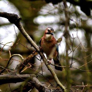
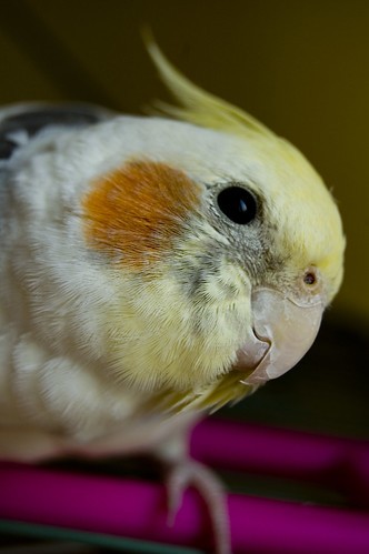
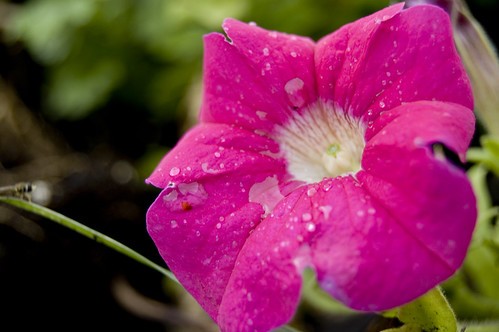
I've been a videographer for a while, but I recently bought a Nikon D50 to test out photography. Here are some shots I took around the house/backyard when I first un-UPS'ed the camera")
I know I still have lots to learn (reading the Nikon manual now), but does anyone have any suggestions?
1:
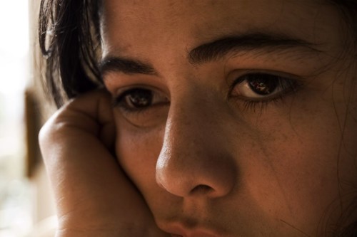
2:

3:

4:

I've been a videographer for a while, but I recently bought a Nikon D50 to test out photography. Here are some shots I took around the house/backyard when I first un-UPS'ed the camera
I know I still have lots to learn (reading the Nikon manual now), but does anyone have any suggestions?
1:
2:
3:
4:


![[No title]](/data/xfmg/thumbnail/37/37602-1ef8dbb1c2d0e4ff347ee65d328c3603.jpg?1619738147)

![[No title]](/data/xfmg/thumbnail/37/37605-90c8efaef5b7d1f52d4bf8e7dfd33673.jpg?1619738148)