theraven
No longer a newbie, moving up!
- Joined
- Oct 16, 2012
- Messages
- 677
- Reaction score
- 102
- Location
- Stoke on Trent, Staffordshire, UK
- Can others edit my Photos
- Photos OK to edit
Yesterday I had my first child shoot in my newly created home studio, I use one light, with softbox and have a 7 foot wide, reversable black/white background.
I am using a Sony a200 (with no live view!
 ) and the weapon of choice was a wonderful Minolta 50mm 1.7 RS, which I have just bought and am in love with!
 ")
Please, be harsh, this is where my earnings are going to be coming from alongside other things, but I have had a lot of interest in childrens shoots.
Enough talking, here are my favorite from the shoot.
1
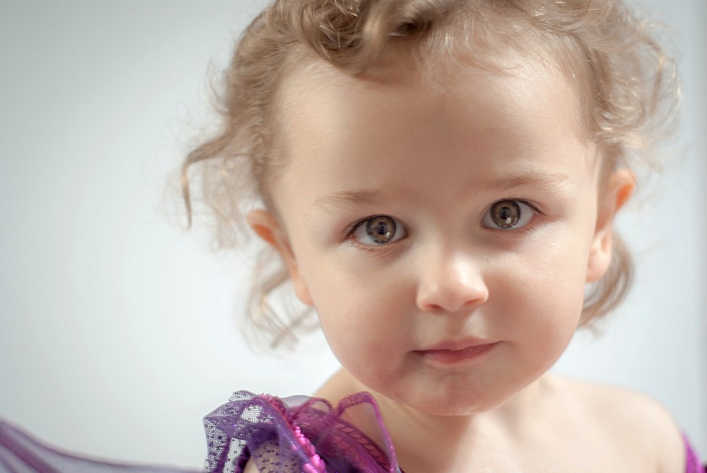
Evelynn by Raven Photography by Jenna Goodwin, on Flickr
2
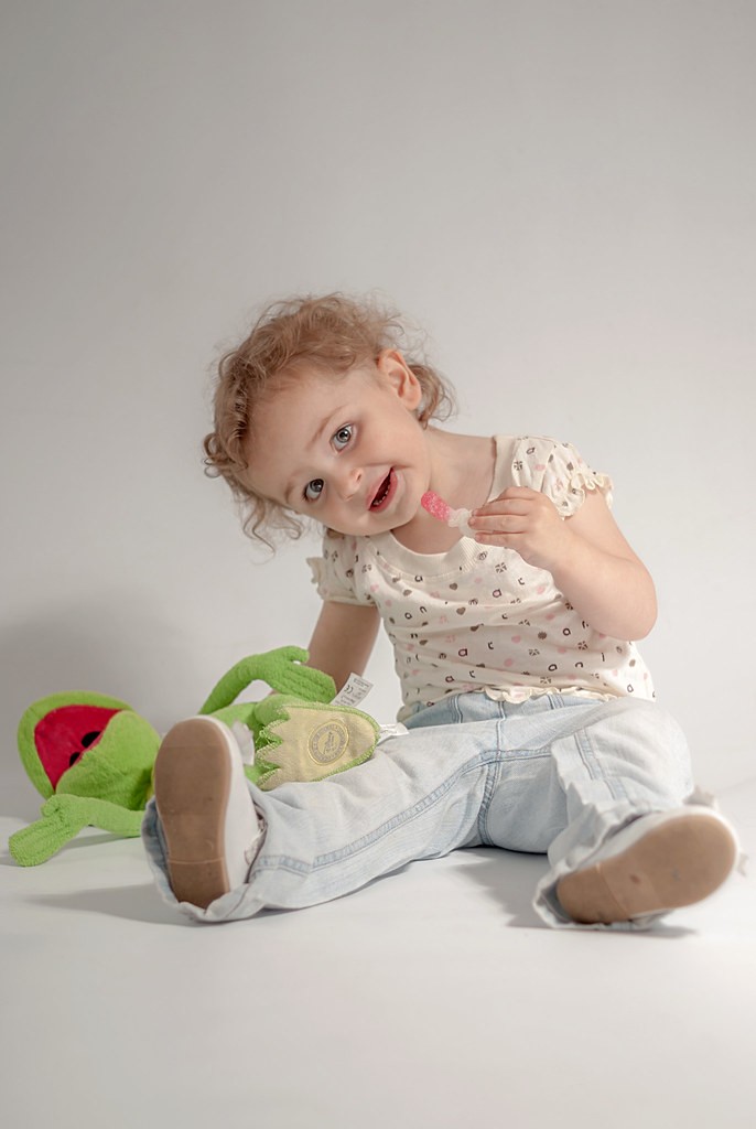
Evelynn by Raven Photography by Jenna Goodwin, on Flickr
3
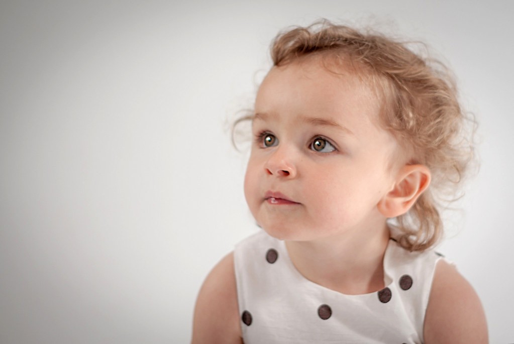
Evelynn by Raven Photography by Jenna Goodwin, on Flickr
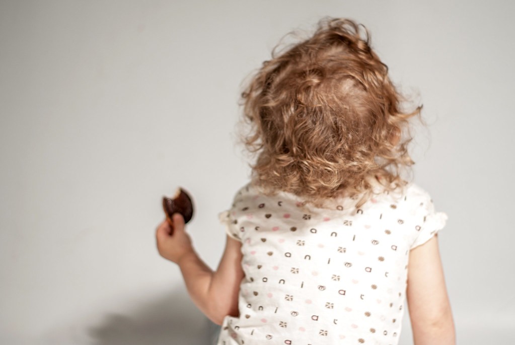
4

Evelynn by Raven Photography by Jenna Goodwin, on Flickr
This one really sums up her had enough attitude!
5
Evelynn by Raven Photography by Jenna Goodwin, on Flickr
I am using a Sony a200 (with no live view!
Please, be harsh, this is where my earnings are going to be coming from alongside other things, but I have had a lot of interest in childrens shoots.
Enough talking, here are my favorite from the shoot.
1
Evelynn by Raven Photography by Jenna Goodwin, on Flickr
2
Evelynn by Raven Photography by Jenna Goodwin, on Flickr
3
Evelynn by Raven Photography by Jenna Goodwin, on Flickr
4
Evelynn by Raven Photography by Jenna Goodwin, on Flickr
This one really sums up her had enough attitude!
5
Evelynn by Raven Photography by Jenna Goodwin, on Flickr


![[No title]](/data/xfmg/thumbnail/31/31979-ea92aca54ae865842d998c9cec534991.jpg?1734160756)
![[No title]](/data/xfmg/thumbnail/33/33495-c9bffdaa44506a6169a2faff5c7e086e.jpg?1734163607)

![[No title]](/data/xfmg/thumbnail/40/40288-4d5d7a8aa74ddfceb5fb82062d9b21be.jpg?1734174702)
![[No title]](/data/xfmg/thumbnail/40/40299-41bf1ccac2889096fb5f4fcffdd56721.jpg?1734174709)


![[No title]](/data/xfmg/thumbnail/42/42062-136a63ad7d0bd740e99ca1fc477f214c.jpg?1734176463)

![[No title]](/data/xfmg/thumbnail/38/38747-bbe463248feefb7affb6b5e00efb70c6.jpg?1734172603)
![[No title]](/data/xfmg/thumbnail/42/42061-9f4eb186c434652d6587c8bcdde59502.jpg?1734176463)