lordtris
TPF Noob!
- Joined
- Jun 24, 2009
- Messages
- 39
- Reaction score
- 17
- Location
- columbus ohio
- Can others edit my Photos
- Photos OK to edit
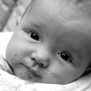
This i my girl friend and she let me experiment with her. 
good bad or other criticism please.




good bad or other criticism please.






![[No title]](/data/xfmg/thumbnail/35/35262-02f8eba4a2a92dbae0b55547bba80b4f.jpg?1734166920)
![[No title]](/data/xfmg/thumbnail/41/41785-954f8d646534214ba1f63ad878e73dd8.jpg?1734176090)