What's new

My First real Photoshoot Please C&C

C&C per req:

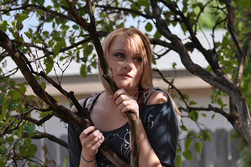
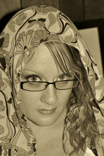
1. WHY this background? You've done a reasonable job of isolating the subject with selective focus, but the background is still very unappealing. You've also got some fairly extreme shadows. Generally dappled ligh is something to avoid unless there's a specific reason/effect you're after. I would alos crop some off the left side to move the subject off-centre.

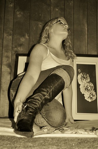
2. An interesting pose, but I'm afraid the 'up the nose' view is NOT something of which I am a fan. I do like the treatment on this, and you've got a good exposure here.

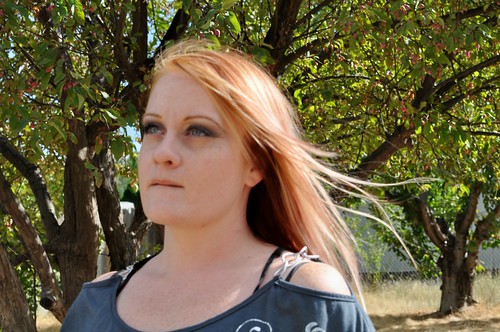
3. I get nothing from this one. You've got trees "growing" from her head, and her expression says to me, "Please let this be over soon!" A reflector image left would have helped to improve the overall exposure. Don't forget to check/organize things like her shoulder straps; as-is, it gives a bit of a messy appearance.

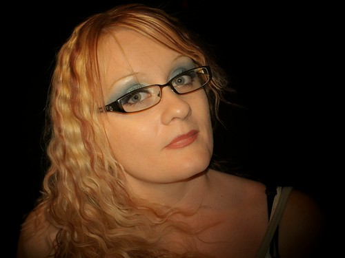
4. IMO, the strongest of the lot ('though again, the straps need attention, as does the stray hair around her right eye). I like the effect and exposure here.

5. This would be nice if it were not for the background.

Just my $00.02 worth - your mileage may vary, and at the end of the day if the client is happy, that's what counts!

~John
 
1. shadows, shadows, shadows ... not working in your favor.

2. awkward pose and edit.

3. missed the focus, the focus is on the tree behind your subject.

4. does she have a glass eye? If not, your processing on her right eye (left in shot) is VERY fake looking.

5. hmm, just not feeling it. Sepia filter isn't working and composition is rather plain.
 
First of all I'm a noob so my following comments I would take lightly as they might not be the best advice but I'll give it a try!!

Number 1 is my favorite but I think it would have looked better if you had of used your flash to get rid of the shadows on her face.

Number 2 I don't like her position at all, she looks funny... To prevent the background shadow you should position her further away from the wall. The pictures in the background is distracting too. Note that the lines in your background should be straightened , tilted lines/horizons look awful.

Number 3 looks like you focused on the trees behind her and not her face. Also it would have looked better if she wasn't biting her bottom lip.

Number 4 She need to not use so much blue eyeshadow, shes naturally pretty and would photograph better without a ton of makeup. Sorry but I just dont like the picture in general.

Number 5 isn't bad, the picture frame in the back is distracting and you also have the shadow from your flash which would have been lessened if you put her further away from the wall as I mentioned before.

Keep practicing, you've got potential! :)

Off topic but can you tell her that her hair looks much better straight, you really shouldn't do curls with straight bangs..
 
Your critique is very helpful!!! I am still new to the editing side of things lol I will play around with a few things and see how it goes. BTW #4 is my fav.
 
I have told her about the makeup thing but she never listens!! I like her hair staight too but she wanted to try something new to add body lol I did her hair lol the style and color :) I am a multitalented artist! lol
 
I have told her about the makeup thing but she never listens!! I like her hair staight too but she wanted to try something new to add body lol I did her hair lol the style and color :) I am a multitalented artist! lol

Ahhh yeah, I have a friend who wont listen to me about her make up too... To add body to hair just hairspray, tease then heat, hold it where you want it until it cools :) I'm the one who does all the hair and makeup before downtown lol... Her hair color is awesome :)
 

Create an account or login to comment

You must be a member in order to leave a comment

Create account

Create an account on our community. It's easy!

Log in

Already have an account? Log in here.

Back
Top Bottom