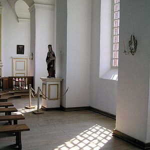
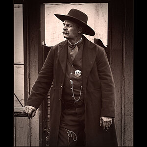
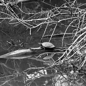
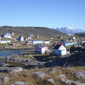
My hopefully memorable website and work

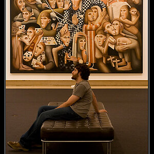
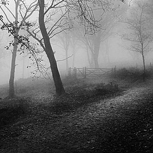
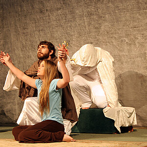
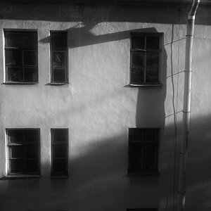
So from a lot of advice on here, I've deleted lots of photos (still may have too many, but I'm having deletion panics and a lot of them are gone already), gotten rid of most of the clicking by changing the gallery layouts, removed the cumbersome title, and reworked the watermark to be less invasive.

Thanks for the feedback everyone. What do you think about the changes?
 
I really like your work! But the first thing that stood out to me was the layout. I simply don't like it. I don't like your watermark either, but that's just my personal preference. I think it just really takes away from your work, because you have this gorgeous image and then a watermark in this weird italic font.

I think it'd be much more effective if you didn't have the glaring: "SmugMug Pro" sticker on the top left.. if there is a way to get rid of that I'd do so. Just make it a little easier to use and more streamlined.. Also mobile-optimized if you can :) And get rid of the folders, like Emily said. Everyone else has some really good criticism as well. It was kind of hard use and didn't really make you want to click around more.

I left the flowers folder because there is a lot in there, and I'm needing to take a break.

What type of layout is preferred for gallery sites? The way I have it set now, the galleries are on the front page (besides flowers, that's for later), and one click gets you into the photos that are displayed in a large size, so clicking on the image for detail isn't always necessary.
 
It looks much better already Matt! Personally, I would remove the categories all together and just have all of your best work there on the home page, and then display images similar to each other in close proximity.

Take a look at Joey L's portfolio: Quick Portfolio | Joey L.

All of his best images are there, and although there are no folders or categories, you can see that he has clearly taken lots of time organizing the order of the images so that they flow into each other, as against having for example the Ethiopia pictures right next to the suited up Nat Geo ads.
 
Joey does GREAT work. Truly an amazing photographer.

I believe he was known for his twilight photo, that started his career?
 

Most reactions

New Topics

Back
Top