Rachel141
TPF Noob!
- Joined
- Aug 17, 2012
- Messages
- 41
- Reaction score
- 1
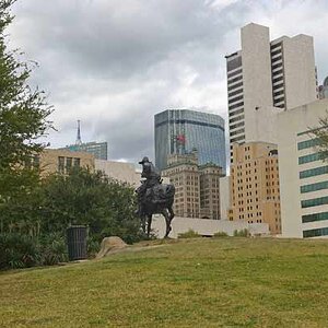
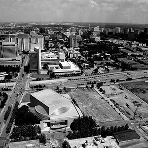
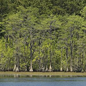
I'm the newest of newbies and I would appreciate any feedback or suggestions. I may have over edited a few of these.
Attachments
-
 $image-2975047692.jpg125.8 KB · Views: 340
 -
 $image-3718862447.jpg111.6 KB · Views: 206
 -
 $image-3752639108.jpg81.8 KB · Views: 215
 -
 $image-2971717559.jpg114.1 KB · Views: 241
 -
 $image-3352506392.jpg159.7 KB · Views: 203
 -
 $image-2332655856.jpg162.7 KB · Views: 353
 -
 $image-188561032.jpg76.2 KB · Views: 212
 -
 $image-16189121.jpg147.9 KB · Views: 214
 -
 $image-629900057.jpg140.2 KB · Views: 224
 -
 $image-3876681844.jpg163.8 KB · Views: 212
 -
 $image-2750688863.jpg161.5 KB · Views: 239
 -
 $image-2458157377.jpg156.1 KB · Views: 216
 -
 $image-2044021949.jpg139.4 KB · Views: 222
 -
 $image-3598390937.jpg87 KB · Views: 206
")


![[No title]](/data/xfmg/thumbnail/32/32161-a5da499a329f1fae945778aac75d4442.jpg?1619735234)