My latest self ports

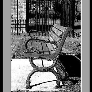
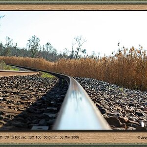
#3 is my favorite too. Its funny how people point things out and I never noticed it until then, and now its all I can stare at. Thanks for all the comments!!
 
Great work!
I'm not a fan of #2 though. The right hand is blurred and weird looking, looks like you have only 2 fingers and the veins are distracting, considering the softness of the rest of it. And the black cloth looks strange, can't put my finger on it really, but like it's photoshopped in on the right leg.
I like the blue stones one the best.
 
this thread made me laugh

The first picture reminds of a James bond shot, with the 60's? style makeup and glamor, I like the poses and the texture that you are laying on.
2 doesn't do much for me, I dont like the difference in skin color from the face to the legs,

Nice work
 
Great work!
I'm not a fan of #2 though. The right hand is blurred and weird looking, looks like you have only 2 fingers and the veins are distracting, considering the softness of the rest of it. And the black cloth looks strange, can't put my finger on it really, but like it's photoshopped in on the right leg.
I like the blue stones one the best.


It is photoshopped because I have HUGE bruises on my legs from work... check out my flickr to see them, I left them on on that one.
 
Wow... Im surprised no one has come on here making the "too much PP" comments. And yes, the heavy PP was intentional
Actually, you might want to PP more, on your legs in #2. Your legs look quite natural, and real, with some areas that look like bruises. If that wasn't your intention, you might want to PP them so they blend more with the rest of you, and match more the other images in the series, with the heavily PPd skin.
 
You just compared me to someone who looks like a Drag Queen (no offense to any DQ's out there... it just wasnt the look I was going for :) )

LOL!

p.s. I like that eye make-up. the little extra on the inside and outside to lengthen the eye is super hot.
 

Most reactions

New Topics

Back
Top