Trever1t
Been spending a lot of time on here!
- Joined
- Dec 30, 2010
- Messages
- 9,331
- Reaction score
- 2,722
- Location
- San Jose, CA
- Website
- wsgphotography.com
- Can others edit my Photos
- Photos NOT OK to edit
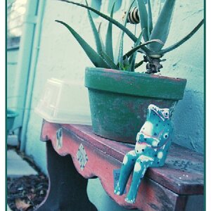
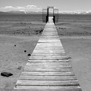
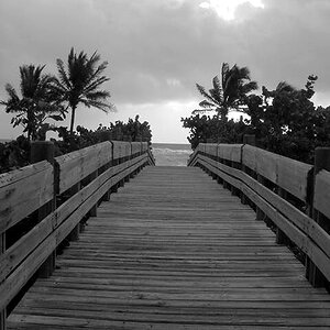
Here are a few of my favorites from my most recent shoot, at my home.
1)

2)
[url=https://flic.kr/p/PuL1r7]
3)
[url=https://flic.kr/p/M9KeZM] [/url][/url]
1)
2)
[url=https://flic.kr/p/PuL1r7]
3)
[url=https://flic.kr/p/M9KeZM]
[/url][/url]")


![[No title]](/data/xfmg/thumbnail/37/37605-90c8efaef5b7d1f52d4bf8e7dfd33673.jpg?1619738148)