What's new

My new Girlfriend - Please C&C

Maxxam71

TPF Noob!
Joined
Jul 17, 2015
Messages
25
Reaction score
15
Can others edit my Photos
Photos OK to edit
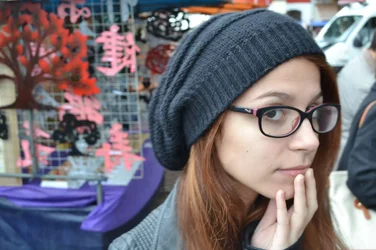
Hello, I am new at this and would like to know where can I improve. Thank you very much!
projectfinal.webp
 
We need more info to C & C. I mean can she cook? Is she funny?

Sent from my SAMSUNG-SM-T337A using Tapatalk
 
I love the composition, the lighting, her expression and the entire mood behind the photograph, however I feel that it's over saturated and that the contrast has been pushed too far to the point that it over accentuates her skin texture. As well, I am a firm believer that selective coloring is an easy gimmick and is only appropriate in rare circumstances, especially for portraits.
I would tone down the contrast and the overall vibrance of the photo that way you can take advantage of the soft lighting and show her good features in a more flattering way. If you look closely, there are areas of her skin that look very yellow and high in saturation, and to me this is not a good look for her.

When it comes to editing I am a firm believer that subtle editing will have the best results on a photo, and this to me has been over-edited. I think you will have much better results if you tone your editing down a bit.

 
Last edited:
Post the original.
 
Hello, I am new at this and would like to know where can I improve.
Does the background have anything to do with the composition/theme? If not, then position the model in the frame so as to have more space in front of her than behind her.

I like the look of this other than the specifics of composition.
 
I would tone it waaayy down, high contrast is never flattering for the subject.
Oh, and this is just an opinion, but selective coloring was cool...20 years ago.
Could you post the original?
 
Processing needs to be dialled back considerably IMO;her skin tones are showing a strong orange cast, and her sclera blue. I suspect that neither of those are accurate. With respect to the composition, I prefer to have the subject looking into the empty space on an image rather than out of it.
 
I love the composition, the lighting, her expression and the entire mood behind the photograph, however I feel that it's over saturated and that the contrast has been pushed too far to the point that it over accentuates her skin texture. As well, I am a firm believer that selective coloring is an easy gimmick and is only appropriate in rare circumstances, especially for portraits.
I would tone down the contrast and the overall vibrance of the photo that way you can take advantage of the soft lighting and show her good features in a more flattering way. If you look closely, there are areas of her skin that look very yellow and high in saturation, and to me this is not a good look for her.

When it comes to editing I am a firm believer that subtle editing will have the best results on a photo, and this to me has been over-edited. I think you will have much better results if you tone your editing down a bit.
+1
 
Thanks for all comments, here is the original, as asked.
 

Attachments

  • 11259721_474483002723297_93248788_o.webp
    11259721_474483002723297_93248788_o.webp
    112.5 KB · Views: 235
Having her left eye covered by her glasses is a bit of a distraction.
The original is much much better. Agree with others to tone down the processing.
 
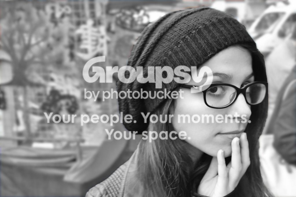
You have my photos are ok to edit, so I did a quick edit. I think it looks much better in BW. jmo
11259721_474483002723297_93248788_o_zps9iz9wltw.jpg
Good job rescuing the movement blur. And yes, the background was distracting so it does look better in B&W
 
She's a pretty girl, very sweet looking. I'm sure you'll make a nice couple. Be kind to her. I agree with the others. I'd cut off everything to the left of her shoulder and go for a vertical format. The left stuff adds nothing to the portrait and draws the viewer's eye away from her face. Either BW or color have their merits. Good luck on the relationship. Maybe she can take a picture of you that you can post.
 
Hello, I am new at this and would like to know where can I improve.
Does the background have anything to do with the composition/theme? If not, then position the model in the frame so as to have more space in front of her than behind her.

I like the look of this other than the specifics of composition.

I am with Designer on that. She is looking off the edge of the photo. I also agree with the color issues. The way it was processed makes her look jaundiced. sscarmack's edit was ok, but the background was even more distracting in the B&W conversion to me.

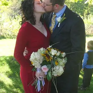
I took his idea using your original and tweaked it a bit. Still not sure I like it though. The background was hard to work with. I didn't spend a lot of time with it. Could have done a better masking job.
test%20002.jpg
 
Last edited:

Create an account or login to comment

You must be a member in order to leave a comment

Create account

Create an account on our community. It's easy!

Log in

Already have an account? Log in here.

New Topics

Back
Top Bottom