Keena
TPF Noob!
- Joined
- Apr 8, 2011
- Messages
- 12
- Reaction score
- 0
- Location
- Perth
- Can others edit my Photos
- Photos NOT OK to edit
I'm not sure why they wont let me post the pictures on here it says "undefined" so I have to put links up again - sorry!
(if you know how to fix this please let me know =D)
I haven't gotten around to editing them much but I like these!
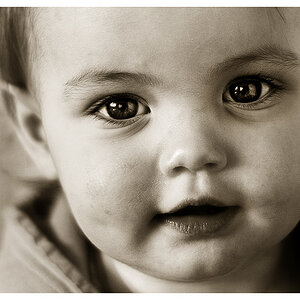
#1 - The Birthday Girl 12-6-2011 (218) | Flickr - Photo Sharing!
F-stop : f/16
Exposure time: 1/200sec
Focal length: 60mm
(flash, auto, strobe return)
It would've been on portrait mode or child mode
I really like this photo - I think it is because she actually smiled! I think with a little editing this one will be really good.
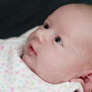
#2 - My Little Man 12-6-2011 (520) | Flickr - Photo Sharing!
F-stop: f/6.3
Exposure Time: 1/500sec
Focal length: 220mm
(no flash,auto)
It is on portrait or child mode again
Obviously I'm going to be bias about this photo because its my baby and its the first time he's seen seagulls up close! But I would still love to have your technical opinions.
#3 - Birthday Girl's Mummy and My Brother (definitely edited! =D) 12-6-2011 (620)edt | Flickr - Photo Sharing!
F-stop: f/5.3
Exposure Time: 1/500sec
Focal length: 85mm
(no flash, auto)
This was on portrait.
The Mummy asked specifically to be black and white. I like leaving in some colour - I know some people think it's cheap and that's fine =D
There are more photos on flickr if you wish to view them.
They are all taken with my new camera - Nikon D5000 and a 18-270mm lens
(if you know how to fix this please let me know =D)
I haven't gotten around to editing them much but I like these!
#1 - The Birthday Girl 12-6-2011 (218) | Flickr - Photo Sharing!
F-stop : f/16
Exposure time: 1/200sec
Focal length: 60mm
(flash, auto, strobe return)
It would've been on portrait mode or child mode
I really like this photo - I think it is because she actually smiled! I think with a little editing this one will be really good.
#2 - My Little Man 12-6-2011 (520) | Flickr - Photo Sharing!
F-stop: f/6.3
Exposure Time: 1/500sec
Focal length: 220mm
(no flash,auto)
It is on portrait or child mode again
Obviously I'm going to be bias about this photo because its my baby and its the first time he's seen seagulls up close! But I would still love to have your technical opinions.
#3 - Birthday Girl's Mummy and My Brother (definitely edited! =D) 12-6-2011 (620)edt | Flickr - Photo Sharing!
F-stop: f/5.3
Exposure Time: 1/500sec
Focal length: 85mm
(no flash, auto)
This was on portrait.
The Mummy asked specifically to be black and white. I like leaving in some colour - I know some people think it's cheap and that's fine =D
There are more photos on flickr if you wish to view them.
They are all taken with my new camera - Nikon D5000 and a 18-270mm lens
Last edited:
![[No title]](/data/xfmg/thumbnail/32/32637-865ab9beec7e00237b64e4fcb8fe947f.jpg?1619735555)


![[No title]](/data/xfmg/thumbnail/33/33030-2d80455c47ebf5f145e0bd5064267aea.jpg?1619735844)

![[No title]](/data/xfmg/thumbnail/42/42349-fa3065c4e047f0114ec8715d9168dff9.jpg?1619740147)