What's new

My Photography

Jsamuel

TPF Noob!
Joined
Mar 26, 2017
Messages
4
Reaction score
2
Can others edit my Photos
Photos NOT OK to edit
Hey guys, can you give me some feedback on these images, thank you.
 

Attachments

  • IMG_20161230_184601_838.webp
    IMG_20161230_184601_838.webp
    45.2 KB · Views: 105
  • IMG_20170101_095426_572.webp
    IMG_20170101_095426_572.webp
    374.2 KB · Views: 108
  • IMG_20170102_160647_734.webp
    IMG_20170102_160647_734.webp
    411.1 KB · Views: 138
  • IMG_20170325_174918_572.webp
    IMG_20170325_174918_572.webp
    315.3 KB · Views: 107
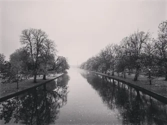
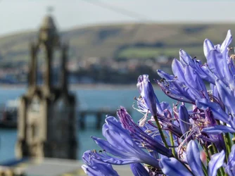
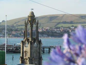
The shot of the canal and oak trees is well-framed I think. The purple flowers shot does not work very well: there's equal emphasis and space on the OOF background and the close-up foreground, and it just does not make a successful shot.

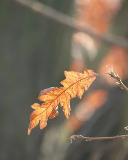
The backlighted leaf is nice, but I think it's framed too low for maximum impact.

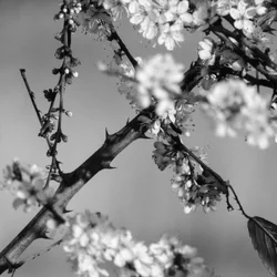
The blossoms and the blackberry vine and its thorns is a contrast between hard,sinewy and prickly, and soft and gentle. I like the contrasting themed elements, and think it's well-composed, with good use of the frame's total space. The diagonal entry of the vine is good, and "active", while the blossoms balance that diagonal. Good B&W conversion too.

Instagram USED TO BE all-square compositions; allowing talls and wides has changed the platform in a big way. A square format forces you to crop away a lot of extra space, which can be a good thing. Like on the leaf photo: as a square, that would be a different picture.

 
I agree with Derrel, especially on the shot with the foreground purple flowers. I know what you were going for because I tend to like taking similar shots. Both foreground and background are interesting and you're playing with focus. However, like Derrel said, there's too much of an equal emphasis on both and so it ends up conflicted: is this a shot of flowers with an interesting background? Or an interesting scene and oh, here are some flowers in the foreground? I think you just needed to choose one or the other. Flowers more interesting? Reframe a bit lower to include more of them. Tower more interesting? Focus on the tower and leave the foreground blurry.

I'd also like to see the leaf as a square shot, and I'm totally digging the final shot of the vine.
 
Hey guys, can you give me some feedback on these images, thank you.
I like the canal photo. I like the orange leaf photo. I like the thorny-stem photo. I like your creative and effective use of depth of field in both. (and others) I don't like the blue flower photo due to the overwhelming dark mass on the left side.
 
Thank you for all the feedback it is really helping understand how to improve my photography. Here is the other shot but with the tower focused instead of the purple plants, I took them back in august.
 

Attachments

  • IMG_0626.webp
    IMG_0626.webp
    1.3 MB · Views: 112
It's an entirely different image with the plant OOF and the background shown in focus.
 
Here is the other shot but with the tower focused instead of the purple plants, I took them back in august.
I like this one a little bit better, although there might yet have been other possible compositions from that same vantage point.

When doing this type of photography I like to make as many shots as I can that are different in significant ways. You know; with flowers, without, with flagpole, without, horizontal, vertical, moving sideways left then right, etc.

You never know when you might hit on a superior composition unless you try.
 
I like the three that everyone else likes.

The second purple flower image is a little better than the first but there is still competition between the tower and the flowers. My eye keeps jumping back and forth between the two elements, each distracting from the other. Sometimes toning down the OOF element helps.
 
I like the second version as well.

One of the valuable things about critique is that it helps people learn - and not only you, but those of us giving the critique as well. As I was looking at your second shot and trying to think of why it works better, I went to look through some of my own shots with blurred foreground to figure out why I framed them the way I did. And so I learned something about my own work.

As I said, I like pictures that play with background/foreground blurriness. Of all the pictures like this that I've taken, I think the more successful ones are the those when I've used blurred foreground elements to frame the subject and kind of "force" the eye to move towards the main interest. Here's one example:


Mural
by limrodrigues, on Flickr

It's a busy photo and there are a lot of elements, but blurring the leaves in the foreground helps the viewer ignore a lot of the business and notice the mural of the kissing couple on the side of the building. The leaves also help obscure some of the visual distractions of street below.

I agree with Designer that it's good to take different versions of the same shot, especially when you can "feel" that there is a shot there but just aren't sure of what it is yet. You're already doing it, and don't be afraid to take even more alternate perspectives. The second version of the flower shot is more successful, but there are many other possibilities for this image. For example, I'm wondering if you had gotten lower and had the line of the flowers pointing towards the top of the tower - that could serve to frame the tower and make it even more of the focus of attention.
 

Create an account or login to comment

You must be a member in order to leave a comment

Create account

Create an account on our community. It's easy!

Log in

Already have an account? Log in here.

New Topics

Back
Top Bottom