What's new

my princess

dphotography

TPF Noob!
Joined
Apr 4, 2012
Messages
135
Reaction score
7
Location
United States
Can others edit my Photos
Photos NOT OK to edit
$mias4.webp
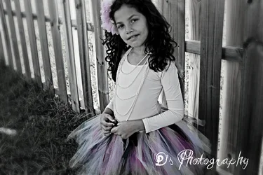
what u guys think of this one...hopefully this one gets a better reveiw ....lol...but all critique are welcome
 
Last edited:
This image definitely needed a portrait frame ..present cropping just helps to ruin the image

Regards :D
 
This is a classic example of selective coloring done poorly (bad choice IMO).

Is the subject of the photo the girl, or the flower & tutu? By removing the color from everything but those two things, you're basically telling the viewer that they are more important than anything else in the photo. If you want the photo to be about your princess, then I would suggest leaving her in color, if you are going to selectively remove color etc.

Also, the photo is shot in a horizontal / landscape orientation, but she (like most people) are taller than they are wide...so the format doesn't match the subject. On top of that, she won't even fit in the frame. Both her head and her tutu are cut off. Don't you think that if she (in her outfit) is the subject, it would be better to include more of her and less of the fence? I do.

I do like the effect of the shallow DOF on the fence, but it takes up too much of the photo and I don't think we need to see that much of it, on the close side of her. You have her pretty much in the middle of the image, which is usually not a great composition. By moving the camera (or her) so that she was more to the right side, would still give us the cool effect on the fence, but would likely be a more pleasing composition.

I'd also suggest getting a bit lower, so that the background was more fence and less ground.

 
This image definitely needed a portrait frame ..present cropping just helps to ruin the image

Regards :D
i didnt crop....all i did was make it back and white and added a splash of color with photoshop...but i think i see what u say ...
 
This is a classic example of selective coloring done poorly (bad choice IMO).

Is the subject of the photo the girl, or the flower & tutu? By removing the color from everything but those two things, you're basically telling the viewer that they are more important than anything else in the photo. If you want the photo to be about your princess, then I would suggest leaving her in color, if you are going to selectively remove color etc.

Also, the photo is shot in a horizontal / landscape orientation, but she (like most people) are taller than they are wide...so the format doesn't match the subject. On top of that, she won't even fit in the frame. Both her head and her tutu are cut off. Don't you think that if she (in her outfit) is the subject, it would be better to include more of her and less of the fence? I do.

I do like the effect of the shallow DOF on the fence, but it takes up too much of the photo and I don't think we need to see that much of it, on the close side of her. You have her pretty much in the middle of the image, which is usually not a great composition. By moving the camera (or her) so that she was more to the right side, would still give us the cool effect on the fence, but would likely be a more pleasing composition.

I'd also suggest getting a bit lower, so that the background was more fence and less ground.
so nothing good ...its all wrong...lol...got it ...
 
why would you cut off her head like that? Why the selective coloring? Why did you blur the picture in post instead of relying on the dof from the camera? Why landscape orientation?

I think you need to set up your shots better. This looks like a snapshot with bad effects afterward. Again, I am not trying to be mean just helpful. Have you looked online for portrait samples from professional photographers? This might help spark some motivation.
 
This is a classic example of selective coloring done poorly (bad choice IMO).

Is the subject of the photo the girl, or the flower & tutu? By removing the color from everything but those two things, you're basically telling the viewer that they are more important than anything else in the photo. If you want the photo to be about your princess, then I would suggest leaving her in color, if you are going to selectively remove color etc.

Also, the photo is shot in a horizontal / landscape orientation, but she (like most people) are taller than they are wide...so the format doesn't match the subject. On top of that, she won't even fit in the frame. Both her head and her tutu are cut off. Don't you think that if she (in her outfit) is the subject, it would be better to include more of her and less of the fence? I do.

I do like the effect of the shallow DOF on the fence, but it takes up too much of the photo and I don't think we need to see that much of it, on the close side of her. You have her pretty much in the middle of the image, which is usually not a great composition. By moving the camera (or her) so that she was more to the right side, would still give us the cool effect on the fence, but would likely be a more pleasing composition.

I'd also suggest getting a bit lower, so that the background was more fence and less ground.
so nothing good ...its all wrong...lol...got it ...

I didn't say that. I could have just said "What a beautiful girl"....but what would you (or anyone) learn from that?
 
This image definitely needed a portrait frame ..present cropping just helps to ruin the image

Regards :D
i didnt crop....all i did was make it back and white and added a splash of color with photoshop...but i think i see what u say ...

Here's one problem. If this shot was framed like this when you took the picture, then you need to work on framing. Allow yourself room when taking a pic because 99% of your photos will be cropped in post. At least mine are.
 
so nothing good ...its all wrong...
Oh no, my friend, the most important thing in the picture, your princess, is very beautiful. So repeat, and repeat, and repeat, shoot her a thousand times :D The quality will appear, step by step.
 
This is a classic example of selective coloring done poorly (bad choice IMO).

Is the subject of the photo the girl, or the flower & tutu? By removing the color from everything but those two things, you're basically telling the viewer that they are more important than anything else in the photo. If you want the photo to be about your princess, then I would suggest leaving her in color, if you are going to selectively remove color etc.

Also, the photo is shot in a horizontal / landscape orientation, but she (like most people) are taller than they are wide...so the format doesn't match the subject. On top of that, she won't even fit in the frame. Both her head and her tutu are cut off. Don't you think that if she (in her outfit) is the subject, it would be better to include more of her and less of the fence? I do.

I do like the effect of the shallow DOF on the fence, but it takes up too much of the photo and I don't think we need to see that much of it, on the close side of her. You have her pretty much in the middle of the image, which is usually not a great composition. By moving the camera (or her) so that she was more to the right side, would still give us the cool effect on the fence, but would likely be a more pleasing composition.

I'd also suggest getting a bit lower, so that the background was more fence and less ground.
so nothing good ...its all wrong...lol...got it ...

I didn't say that. I could have just said "What a beautiful girl"....but what would you (or anyone) learn from that?
i understand what u said ..i am not offeneded i get what ur saying step by step ..but its all wrong ..other than my beautiful daughter...lol.. critique r good to learn but if i was someone that would take everything serious i would be discouraged right know..its always good to at least find one good thing and u didnt say one good thing..so its all wrong..dont worry ill surpass my own expectations...lol...thanks for viewing it step by step it does help
 
I did say that I liked the shallow DOF on the fence ;)
 
I did say that I liked the shallow DOF on the fence ;)
mike lets try this again..i will post another pic u will critique it and i will learn from but u have to say one good thing ...your in
 
May I critique?

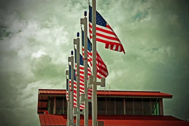
I love the colors but...it would have been better to shoo this from the right side of the flags so that the poles don't get in the way of each flag. Right now the subject are the poles, not the flags. Try to cut back on the vignetting, it doesn't look good if it isn't done correctly.
 
i have the same on that i edit in bw ..but i wanted to keep the colors of the flag ..i am gonna re edit allot of pics just to compare ..maybe ill post them ...lol
 

Create an account or login to comment

You must be a member in order to leave a comment

Create account

Create an account on our community. It's easy!

Log in

Already have an account? Log in here.

New Topics

Back
Top Bottom