reissigree
TPF Noob!
- Joined
- Sep 27, 2011
- Messages
- 261
- Reaction score
- 17
- Website
- www.flickr.com
- Can others edit my Photos
- Photos OK to edit
Been a few weeks since I started. Let me know how I'm coming along! CC please!
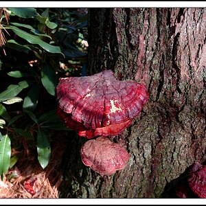
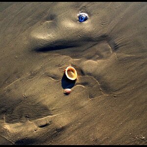
1.

DSC_0090 by reissigree, on Flickr
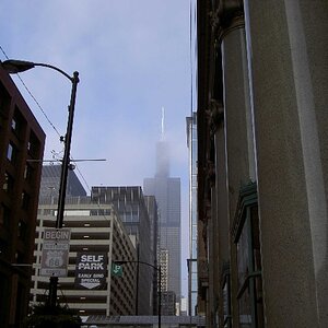
2.

DSC_0016 by reissigree, on Flickr
1.
DSC_0090 by reissigree, on Flickr
2.
DSC_0016 by reissigree, on Flickr
") Great job though
Great job though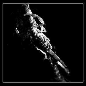
![[No title]](/data/xfmg/thumbnail/35/35262-02f8eba4a2a92dbae0b55547bba80b4f.jpg?1619736968)


![[No title]](/data/xfmg/thumbnail/39/39469-3f2d242112dec8dc3e7b2836cc85afec.jpg?1619739042)