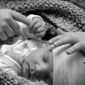
My son's first trip to my new studio

inTempus

TPF Noob!
Joined
Dec 15, 2008
Messages
3,692
Reaction score
4
Location
Indiana
Can others edit my Photos
Photos OK to edit
I just finished my home studio a little while ago... well, mostly completed it anyway. I'm still doing some little things here and there. But I talked my wife into taking our son down for a shoot before we headed out to Easter dinner with the family.

Here are the first official home studio shots of my boy! Yes, I need something better than the white muslin backdrop... paper is on the way. :)

511970491_g8r2n-L.jpg


512889122_YZj89-L.jpg


512891754_6gcqP-L.jpg


Thoughts?
 
The white background looks very grey The white in his shirt looks white though,. Perhaps next time, consider a different choice of trousers to background, *contrast*

Boy and bunny's foot are clipped in #2.

Cute kid.


[Edit] Ooops, too much fun last night. I know you've got a Canon MK something....... sorry dude. Removed comment.
 
Last edited:
May want to move your fill back a bit to reduce the 'dual catchlights'. Moving the subject a little further from the background will also allow you to hide the wrinkles a bit easier (very evident in 2 and 3).
 
Cute kid, you were using a pretty wide lens for formal shots, you're going to want to use your 70-200 instead for a more accurate perspective, also stop your lens down, the vignetting on these is pretty distracting.
 
"the vignetting on these is pretty distracting." Personal choice really, Some people go to great lengths to put it into the shots. Maybe a little tweak in curves to lift the greys a little. Not bad though.
A trick I use is to have Mum or whoever stand close behind me, When she moves the baby will look at her, it brings the eye line closer to the lens.
 
Cute kid, you were using a pretty wide lens for formal shots, you're going to want to use your 70-200 instead for a more accurate perspective, also stop your lens down, the vignetting on these is pretty distracting.
The vignetting is my poor attempt at trying to bring the focus to the subject vs. what I thought was too much white (my only backdrop for now). Here's one without it.

510814268_ex4yb-L.jpg


I did bring the exposure down a bit too though (hence the white looking a little grayish). The pants were totally the wrong color for the background and the orange really didn't complement his hair and complexion (that's his mom's fault!). :)

I'll give the 70-200 a shot, thanks for the tip.
 
May want to move your fill back a bit to reduce the 'dual catchlights'. Moving the subject a little further from the background will also allow you to hide the wrinkles a bit easier (very evident in 2 and 3).
Thanks. I didn't even notice that until you posted this. I will be more conscious of this in the future.
 
A trick I use is to have Mum or whoever stand close behind me, When she moves the baby will look at her, it brings the eye line closer to the lens.
I had her moving around, some behind me (as in the shot below) and others off to the side.

510813059_j7vf6-L.jpg


He was being quite a handful. He was bouncing, moving, wiggling, quite funny. My wife had to stay close behind him for several of the shots to make sure she could catch him if he fell onto the hardwood floor. I eventually used a pillow to keep him upright so she could move around.

Here's a shot of Mom trying to wrangle him into a pose. I thought it was funny because you can see him pulling her hair and he has yanked her glasses off. I couldn't stop laughing.

510813969_t7fZp-L.jpg
 
I'd get those shoes outta there. The take away a lot from the picture. Not only are they a big dark object in the foreground of a frame that is mostly filled with whites and light colors, but more importantly, a baby's bare foot is infinitely more attractive than the bottom of a shoe. Generally, the bottoms of shoes are to be avoided, just like the backs of hands. And you really need a dedicated background light to get that thing whiter. It really just has that bed sheet look.
 
I'd get those shoes outta there. The take away a lot from the picture. Not only are they a big dark object in the foreground of a frame that is mostly filled with whites and light colors, but more importantly, a baby's bare foot is infinitely more attractive than the bottom of a shoe. Generally, the bottoms of shoes are to be avoided, just like the backs of hands. And you really need a dedicated background light to get that thing whiter. It really just has that bed sheet look.
Good point, I didn't turn on my background light. I dislike the muslin, period. I ordered seamless paper which should be here next week. I'm going to give that a shot.

Here's the studio:

504781251_iFdVF-L.jpg
 
Paper and cloth are both good. They both have strengths and weaknesses. For products/stills, paper works well. But for things that move, like babies, paper won't do very well. I think part of your problem might be you subject to background distance. What you really need is the background section of the cloth where it is, and the subject table about 3-4 feet further forwards, with enough cloth to still cover it. You can get much more independent control of background/subject light ratios that way. That's way you can just crank up the background light, and blow it out, and not spill much light onto you subject. If you switch to paper, but keep the distances the same, I suspect you'll have the same problems.
 
eek that's a tight studio!

(one of the reasons I prefer to shoot on location)


If you want the background knocked out, use a background light and create distance between your subject and the background, you need to control your lighting, which with the looks of your room seems to be close to impossible because of size constraints and the fill card of a ceiling.

another thing, what is the color of the walls, because that's going to tweak your photos too. If the walls are green, the you'll be consistently adding more magenta to your images.
 

Most reactions

New Topics

Back
Top