dezzyrawrz
TPF Noob!
- Joined
- Mar 14, 2013
- Messages
- 26
- Reaction score
- 0
- Location
- mckeesport
- Can others edit my Photos
- Photos OK to edit
Could I get some opinions and advice on my photographs i have taken, I'm very new at photography 
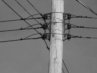
telephone pole
#1
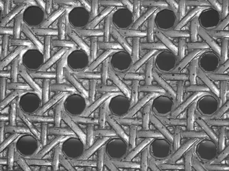
Ceiling design
#2

telephone pole
#1
Ceiling design
#2










![[No title]](/data/xfmg/thumbnail/41/41933-d5af292b78e4b91211e86e0f3205eda8.jpg?1734176289)