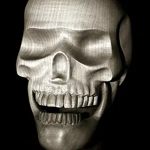
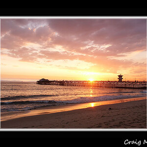
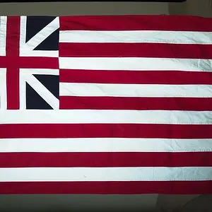
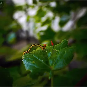
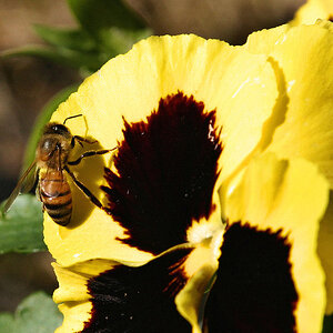
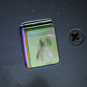
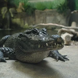
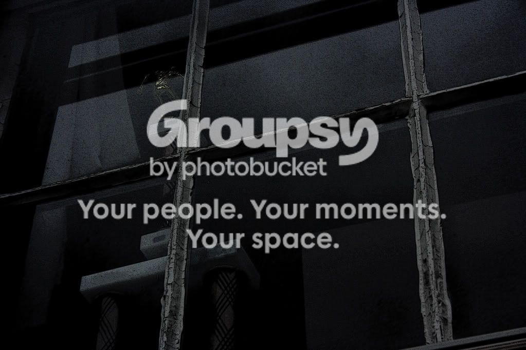
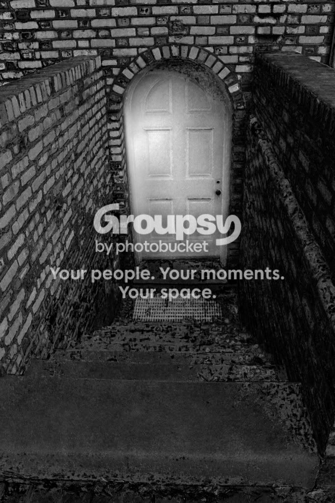
the first looks great! i like the contrast looks amazing! the third needs more focus. oh btw the second one scares the hell out of me i think something is bound to come out!
#1 looks underexposed to me, I like the idea though
#2 is my favorite, but the contrast looks like it was turned up a little bit too much
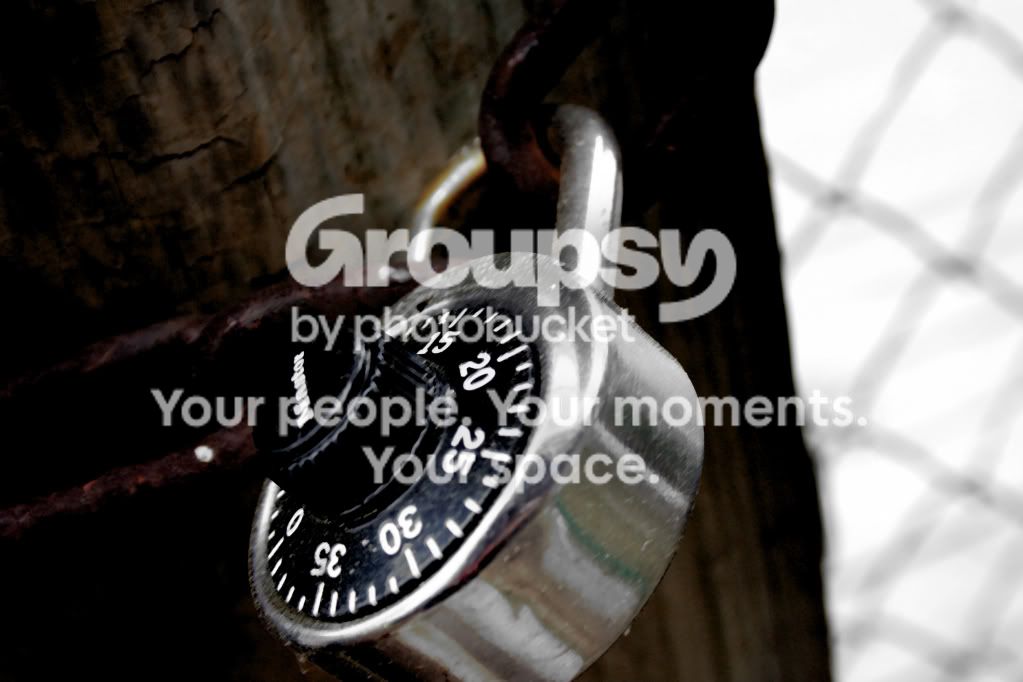
#3 has some great promise, but again the contrast looks too high and looks as though the focus needs to be moved from the top of the combination wheel to maybe the numbers?
#1 looks underexposed to me, I like the idea though
#2 is my favorite, but the contrast looks like it was turned up a little bit too much
#3 has some great promise, but again the contrast looks too high and looks as though the focus needs to be moved from the top of the combination wheel to maybe the numbers?




 anyone else?


 Pixmedic's Photo Contest! ($100 prize)