What's new

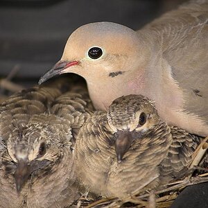
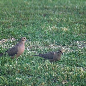
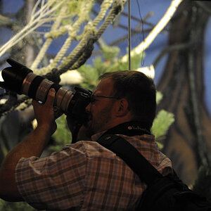
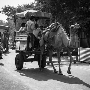
New here just showing some of my work

beatniktwist

TPF Noob!
Joined
May 6, 2013
Messages
19
Reaction score
7
I'm down to receive any critics you may have
 

Attachments

  • $image-1749878426.webp
    $image-1749878426.webp
    45.3 KB · Views: 166
  • $image-1559290225.webp
    $image-1559290225.webp
    49.1 KB · Views: 154
  • $image-1110945223.webp
    $image-1110945223.webp
    30.2 KB · Views: 157
  • $image-4145033317.webp
    $image-4145033317.webp
    13.4 KB · Views: 154
  • $image-3842031352.webp
    $image-3842031352.webp
    40.8 KB · Views: 164
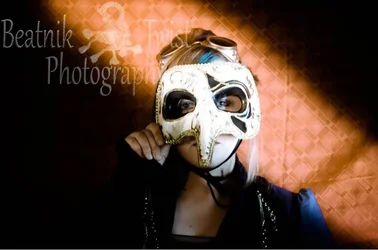
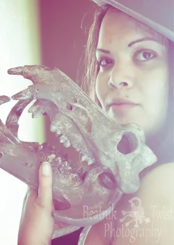
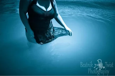
Your logo is way to BIG and distracting. It overpowers the rest of the image.
 
Your logo is way to BIG and distracting. It overpowers the rest of the image.

Sorry about that I stamp my logo on anything I put on Facebook and I joined this forum via mobile. I didn't even know it was a full online forum lol. I just grabbed these off my FB page. Definitely will use the computer next time.
 
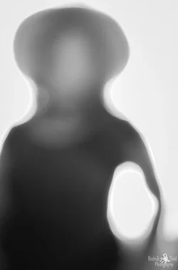
I like the idea behind the second one... maybe try some different angles aside from straight on - probably make for some really cool abstracts.
 
All very interesting.
 
Now that I think of it I rarely ever switch up my point of view or angles. Which is strange since I like to keep things weird. I have a line/symetry peeve. If I put a graph over my picture I want it to be even. But I think your right I should try switching it up.
 
Your logo is way to BIG and distracting. It overpowers the rest of the image.

Sorry about that I stamp my logo on anything I put on Facebook and I joined this forum via mobile. I didn't even know it was a full online forum lol. I just grabbed these off my FB page. Definitely will use the computer next time.

Your going to find a couple things out about these forums:
1. Critique can be harsh. Many post images, get thrown to the dogs, and never come back. In most forum members views, its no skin off our back, so come at it from that angle, don't take anything too seriously or you won't last long.

2. We like people posting, but theres more than enough images to go around. Try to limit your posts to 2-3 images at maxif your looking for critique.

3. Many users aren't fond of watermarks. The general consensus is that they should be small and unobtrusive, if present at all. Saying images were sourced from another website and thats why they still have a giant watermark won't fly for most members. They'd simply question why the watermarks are present at all.


Now that I think of it I rarely ever switch up my point of view or angles. Which is strange since I like to keep things weird. I have a line/symetry peeve. If I put a graph over my picture I want it to be even. But I think your right I should try switching it up.

Honestly, and this is me critiquing, but I don't see what your talking about. Your right, your images tend to have an odd type of content to them, but I see little evidencing a "line/symetry peeve." Many of the compositions seem standard, run of the mill from a symmetry standpoint. Nothing too abstract.

If I had to pick one I like the most, it would be number two. (Oh yeah, don't forget to number your images) Of the entire set it seems the most artistic IMO.


Welcome to the forum! Hope your stay is longer than most :)
 
Your going to find a couple things out about these forums:
1. Critique can be harsh. Many post images, get thrown to the dogs, and never come back. In most forum members views, its no skin off our back, so come at it from that angle, don't take anything too seriously or you won't last long.

2. We like people posting, but theres more than enough images to go around. Try to limit your posts to 2-3 images at maxif your looking for critique.

3. Many users aren't fond of watermarks. The general consensus is that they should be small and unobtrusive, if present at all. Saying images were sourced from another website and thats why they still have a giant watermark won't fly for most members. They'd simply question why the watermarks are present at all.

Honestly, and this is me critiquing, but I don't see what your talking about. Your right, your images tend to have an odd type of content to them, but I see little evidencing a "line/symetry peeve." Many of the compositions seem standard, run of the mill from a symmetry standpoint. Nothing too abstract.

If I had to pick one I like the most, it would be number two. (Oh yeah, don't forget to number your images) Of the entire set it seems the most artistic IMO.

Welcome to the forum! Hope your stay is longer than most :)

Lol
 

Create an account or login to comment

You must be a member in order to leave a comment

Create account

Create an account on our community. It's easy!

Log in

Already have an account? Log in here.

Back
Top Bottom