
Kimberly81
TPF Noob!
- Joined
- Jul 9, 2008
- Messages
- 207
- Reaction score
- 1
- Location
- Independence, MO
- Website
- www.myspace.com
- Can others edit my Photos
- Photos NOT OK to edit
She needed some updated photos for her model portfolio so we took some today, I have been so busy shooting for everyone else that she has not had anything new for a minute. She just turned 8 on Saturday.... man they grow up quick! It's scary! Anyway, C&C is welcomed, but as always, please be kind with your C&C.
1 (my favorite)

2

3

4 (before anyone says it, I know I went a little nuts with the tilt on this one but I love her personality in it)

5

1 (my favorite)
2
3
4 (before anyone says it, I know I went a little nuts with the tilt on this one but I love her personality in it)
5


") Merry Christmas!
Merry Christmas!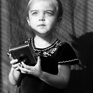
![[No title]](/data/xfmg/thumbnail/41/41798-aacfc8368463d919cba743fe318706b6.jpg?1619739897)
![[No title]](/data/xfmg/thumbnail/41/41796-690c109012575e084970902dbd3894ba.jpg?1619739896)
![[No title]](/data/xfmg/thumbnail/41/41795-6bc3a19e590a6be6bd169ab2acaee30d.jpg?1619739896)


![[No title]](/data/xfmg/thumbnail/41/41797-ed370d68dae70f5b0a7252ec2d525912.jpg?1619739896)


![[No title]](/data/xfmg/thumbnail/41/41799-fe172a668fba7717bf773664387d64aa.jpg?1619739897)