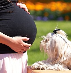
I know, thank god I have a day job and thank god she didn't ask me for the goofy hands/heart thing.... thanks for looking and commenting on my leap into my first photo forum.
Two main issues I see here: One is the background; while you've rendered it nicely out of focus, there's still enough in it to be very busy and distracting; look for even, calmer backgrounds, the other is the fact that materinity photography is all about the woman's "bump" and in each of these shots you've crowded it to the left-hand side of the page (remember that since most of us are used to reading left to right, our eyes naturally start on the left side of the frame and move to the right where there's nothing to hold our attention) and all but obscured it with arms (I agree with the football analogy above). They're a good start, but I think there's a LOT of room for improvment. I would suggest offering a re-shoot and trying a few more poses/compositions.
I think the first I like best of the four.. Do you have other shots? It's definitely not traditional to share basically four of the same image when you're posting so I found that odd? I agree on the background but I think if these were full shots and not just belly shots the background wouldn't seem as distracting.
I think the first I like best of the four.. Do you have other shots? It's definitely not traditional to share basically four of the same image when you're posting so I found that odd? I agree on the background but I think if these were full shots and not just belly shots the background wouldn't seem as distracting.[/QUOTt
thanks for the feedback...I think we can chalk it up to forum and portrait photography virgin issues....but if you really want to know my rationale for posting basically the same shot....I was puzzle by how to best fill the frame. I am going to post a couple more now.
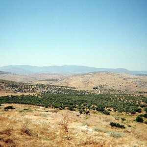
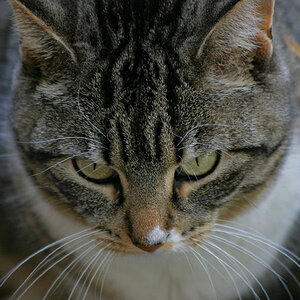
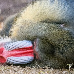
Some new shots for feedback. I have been working on spot metering for better exposure, still have a lot of work to do, seems I get a lot of under exposure on my outdoor shooting.


![[No title]](/data/xfmg/thumbnail/37/37526-bc41ead4d3f2330d3e37da95abf9132e.jpg?1619738130)

![[No title]](/data/xfmg/thumbnail/32/32813-9ade0851a7432024734a0c95c03e37d0.jpg?1619735670)
![[No title]](/data/xfmg/thumbnail/34/34116-b81991a4a8a532509a981cadbacd573c.jpg?1619736286)