What's new

New to Photography- First sunrise pictures

Mathu126

TPF Noob!
Joined
Dec 7, 2014
Messages
3
Reaction score
0
Can others edit my Photos
Photos NOT OK to edit
Hello all. This is my first post and I'm excited about getting started in photography. I've only had my camera for a few months now but am in love with the hobby. This morning was my first attempt at photographing a sunrise and I'd like for the members to review/ critique my photos. Feel free to even edit them if will.

The pictures I have posted are unedited JPEGs that I converted straight from the raw file. I would love to have some critique of the photos themselves (are they decent, is the composition acceptable, does the lighting look ok, etc...?). Also, if anyone would like to edit 1 or all of them and let me know what you did to make it a good looking photo (if possible).

Just so you know what I'm working with, I have a Nikon D5300 and am using the 18-140mm kit lens. As mentioned, I'm a newbie so I don't have any formal training. I played around with settings this morning but for the most part, these are auto mode.

Any help would be appreciated.

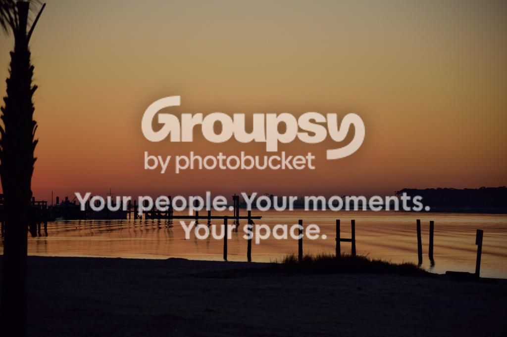
1. Just as sun is coming up. Nikon D5300. 18-140mm lens. 140mm-Auto (ISO 250), 1/500s, f5.6, 0EV

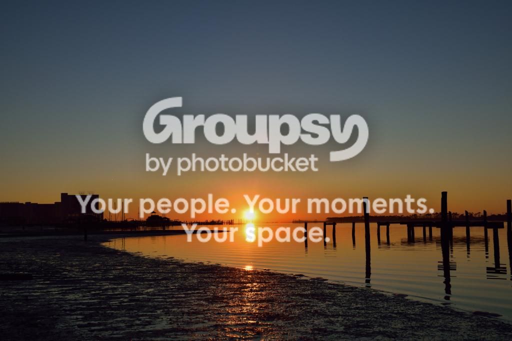
2. Just a few minutes up. Nikon D5300. 18-140mm lens. 32mm-Auto (ISO 200). 1/500s- f/11, 0EV
 
Hey, welcome!

In both shots, the foreground is underexposed, so work on that. In the second shot, the sun is centered, with little else going on in the shot. Sometimes just aiming your camera at something else is all it takes to make a more artistic composition.
 
You have captured some nice light and good on you for getting up early.
They are certainly better than a lot of beginner photos so well done on that.
As mentioned, the dark areas a just a little bit too dark. If you have some processing software, you can lighten these shadow areas to bring out a little bit more detail.

In the first image can I suggest you try the following crop and see if you like the result:
Crop out the palm tree on the left - it seems a bit too uncomfortably close to the left edge. And also crop out about 10% of the bottom. The bank doesn't offer much more than a framing element. What is great about this image are the posts in the water and the tree line at the back.
You might find this gives a stronger image which removes some of the distracting elements.
 
Thank you guys so much for the replies. I agree with both of you on how to improve the photos. I have done some cropping to both of the images. On the first picture, I cropped as suggested by AceCo55 and then increased the sharpness. I also tried to brighten up the foreground and add a bit of brightness in the background.
In the second image, I cropped it so that the sun is not in the center. You can see the posts in the water a little more clearly and I brightened up the foreground as in the first photo. I think they both look better. Please let me know if you agree or if you think additional editing can be done to help the quality. Thanks.

1.


2.
 
the shots are amazing it needs a lot of dedication and passion to take this kind of shots they are really beautiful.
 
I think both are much stronger images. Hard to tell, but I think I like the fist one better - just for the strong lines/composition. I really like the colours in the second.
Nice work.
 
Again, thanks for the feedback. I will continue to work on these and I'll upload more to get additional feedback.
 
Sunrise from TPF.webp
Thank you guys so much for the replies. I agree with both of you on how to improve the photos. I have done some cropping to both of the images. On the first picture, I cropped as suggested by AceCo55 and then increased the sharpness. I also tried to brighten up the foreground and add a bit of brightness in the background.
In the second image, I cropped it so that the sun is not in the center. You can see the posts in the water a little more clearly and I brightened up the foreground as in the first photo. I think they both look better. Please let me know if you agree or if you think additional editing can be done to help the quality. Thanks.

1.


2.
The second image is cropped too much for my taste. You have a nice leading line working from right to left taking the eye right to the sun. When you cropped it you broke that line destroying the effect. I would have cropped it more like this. But, to be honest, the original with the sun dead center works pretty good for me.
 
Last edited:
These are really good for just starting. Far as the lens, i shoot with the same one quite a bit. It was cheap and convenient. Unfortunately the haze/gloss thing and not true color is kind of what it produces and it is hard to pull off a realistic looking photo with it. It is a bottom consumer grade lens. If it starts to bother you then you may want to look into another lens. i still use mine, but it does drive me sort of nuts. Enough that i will occasionally swap it out for my cheap nifty fifty just to get away from it. i am hoping to eventually get better lenses and put my 18-140 on a shelf for back up use. Finding something in the right $$ to fill that range seems to be somewhat difficult.
 

Create an account or login to comment

You must be a member in order to leave a comment

Create account

Create an account on our community. It's easy!

Log in

Already have an account? Log in here.

Back
Top Bottom