I like them a lot! But you want opinions and here goes...
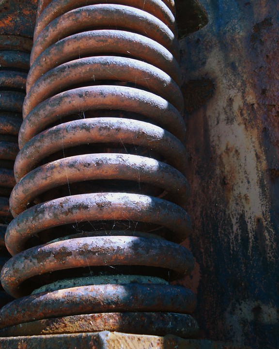
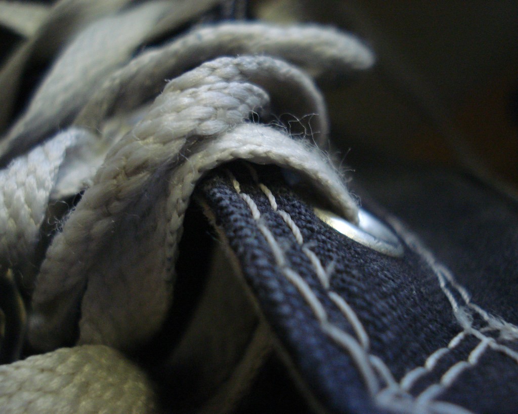
The spring simply doesn't do much for me, not that it's a bad shot. I understand the texture/color/dof field thing you were after. It is a crisp shot, just not too interesting as a stand alone shot. BUT, I do a lot of "stock" photos for print advertising and people use this stuff all the time (usually with text written all over it). Funny thing is that the harness and rope photo has the same stock qualities but I like it better than the spring. I still wouldn't hang it on the wall as a stand alone shot but it is a good photo. They would make a good series on industry if you can blend in the theme (but it might be hard being one is very much the metallic item and the other is non-metallic).
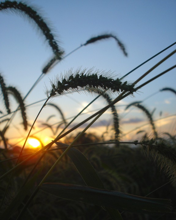
I know what you're going for in the sunset/grass photo but I'd like to see either more black (silhouette) from the grass or more definite color from it. The almost seeing those colors were a bit off for me.
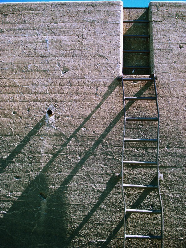
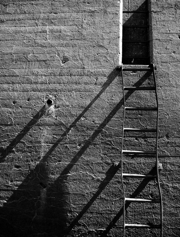
Last (from me); the ladder/building thing. Personally, I would crop the sky completely out of it but not to cut off the other ladder in the window (or what ever that area is). I would like people viewing it, if it were mine, to wonder where the ladders are leading. We know "up or down" obviously, but "How far up or down"? Also, I think this shot would make a great B&W or colorized (monochrome) photo.
Don't get me wrong. I love them all. This comment is only from a personal prospective.
I just realized that is a shoe... not a harness. I feel like half an idiot. I still like it.

") lol
lol


![[No title]](/data/xfmg/thumbnail/36/36651-948fc64542c147745d3f3c48bce31dce.jpg?1734169165)


![[No title]](/data/xfmg/thumbnail/33/33024-f9a0cb6482030fec791845de1a21c82a.jpg?1734163016)

![[No title]](/data/xfmg/thumbnail/42/42476-18beb1ac3f51cc5df765155cf67f2d5e.jpg?1734177004)