What's new

New, what do you think?

D3Shooter

TPF Noob!
Joined
Sep 6, 2012
Messages
17
Reaction score
0
Location
Dayton, Ohio
Wanted to get opinions on my work. So let me have it good and bad!
 

Attachments

  • $image-1687621635.webp
    $image-1687621635.webp
    43 KB · Views: 191
  • $image-1308385228.webp
    $image-1308385228.webp
    31.1 KB · Views: 176
  • $image-2659768686.webp
    $image-2659768686.webp
    60.3 KB · Views: 198
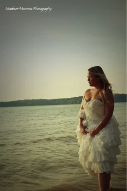
#1 underexposed, gathered dress is not flattering, horizon tilted, too much sky, nothing to indicate what the model is looking at, or why she is so unhappy.
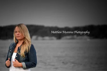
#2 model looking to the short end of the frame, watermark has prominance
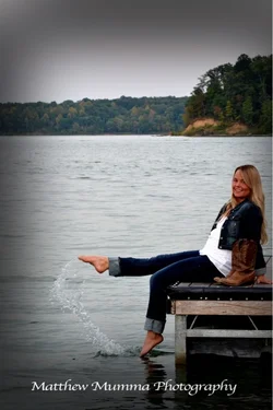
#3 cute pose, underexposed a tad, too much sky, vignet doesn't help, maybe this shot should have been in landscape format, losing the trees and sky.

 
^ This.( What designer said ) Plus in #3 it is supposed to look natural and not staged, yet the look on her face is like "am I doing this right" since she is looking at the camera.
 
Parker219 said:
^ This.( What designer said ) Plus in #3 it is supposed to look natural and not staged, yet the look on her face is like "am I doing this right" since she is looking at the camera.

I'll never admit this again, but just before the shot a boat hit the dock I was on and she was laughing like crazy at me. Not that that justifies a staged pose, just a funny behind the scene moment.
 
#1 underexposed, gathered dress is not flattering, horizon tilted, too much sky, nothing to indicate what the model is looking at, or why she is so unhappy.
#2 model looking to the short end of the frame, watermark has prominance
#3 cute pose, underexposed a tad, too much sky, vignet doesn't help, maybe this shot should have been in landscape format, losing the trees and sky.

Yes.
 
Not a fan of the heavy vignetting.
 
I think the exposure in #1 is appropriate and shows off the dress quite nicely. It's evening, after all. Tilted horizon is bad in this case, but I can't quite imaging what's going on here. Is she leaning way back or something? Fixing the horizon will surely ruin her.

#2 is quite unflattering to her, and selective color is definitely a pet peeve of mine. I will say that I almost didn't notice it, so this is maybe a good usage of it. Looking out of frame is something everyone says is a bad idea, but I am not so sure. This is the second one I've seen recently where it didn't actually bother me much. Mostly, though, her expression isn't something she's likely to be happy with.

I kind of like #3. Cliched, obviously staged. So what? The vignette is too much, and I wish her boots were more visually separated from her jacket, tonally or whatever.
 
Tudo o que foi dito, reforçando o uso excessivo de vignetting. :thumbup:
 
Selective color can be risky but you did very smoothly...I like it! I know vignetting can be cheesy and there is a fine line..but I personally think it gave these photos great edge!!! The first is a little undersposed and I know this was intentional but I think personally I would have loved to see her skin a little more luminous. 3 is a winner! I LOVE IT!!!!!
 

Create an account or login to comment

You must be a member in order to leave a comment

Create account

Create an account on our community. It's easy!

Log in

Already have an account? Log in here.

New Topics

Back
Top Bottom