New York City Landscapes. Need honest C&C please.

WilfordSy

TPF Noob!
Joined
Oct 9, 2011
Messages
54
Reaction score
5
Location
New York
Can others edit my Photos
Photos NOT OK to edit
Hi All,

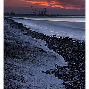
I need some honest opinion / comments on my landscape photos. All done in 1 day (just took them yesterday). I wanted to get some sunset photos but it was really cloudy yesterday. The first pic is the best that I could get for a sunset pic. It even looks like sunrise.

The TimeSquare photo (#4) is by far the hardest to get. On top of the hundreds and thousands of tourists/people walking by, I can't set a longer shutter speed because of all the lights/electronic billboards that will overexpose my shot. What I did was I took my money shot at Shutter Speed: 2sec to get the car tail lights (which overexposed the billboards) and then took some underexposed photos that is set for the background/billboards and combined the photos in Photoshop. Please let me know what you think! Thank you!

LUwgL.jpg


Photo #1: "Manhattan Bridge" - ISO 100, 24mm, f/22, 4sec - Enhanced with photoshop

zdHjy.jpg


Photo #2: "Manhattan Bridge at Night" - ISO 200, 24mm, f/18, 30sec - Enhanced with photoshop

X3WY4.jpg


Photo #3: "Brooklyn Bridge at Night" - ISO 200, 18mm, f/18, 30sec - Enhanced with photoshop

HWeTu.jpg


Photo #4: "Timesquare" - ISO 100, 18mm, f/22, 2sec - Enhanced and Edited with photoshop
 
I like your compositions and colors, #3 especially. I would however suggest shooting at a wider aperture perhaps? The diffraction takes away from them a little bit I think, and if you're shooting such a short focal length, you don't actually need to stop down so far. Check out a depth of field table: Depth of Field Table. Those shots at 18mm for instance would still have plenty of field at f/8, but they'd be sharper and the highlight spikes would be more subtle. Composition and processing are nice though!
 
C&C per req:

1. I don't find this one terribly interesting; there's not distinct subject, and while the bridge makes a great leading line, it leads nowhere. The under-exposed foreground isn't helping matters either.

2. I like the lighting here, but I think to really get the most of out this one it should have been at least a three-shot pano including the whole bridge and some city at either end.

3. As per #1 on the use of leading lines.

4. I like this one; the strongest of the set IMO, BUT you need to try and pull a little more detail out of the dark area. If you could reshoot this with al of those windows lit up, it would be a great shot, or even try brightening the area would help.

Overall, they're a nice set, 'though I think rather more city than landscapes.

Just my $00.02 worth - your mileage may vary.

~John
 
I like your compositions and colors, #3 especially. I would however suggest shooting at a wider aperture perhaps? The diffraction takes away from them a little bit I think, and if you're shooting such a short focal length, you don't actually need to stop down so far. Check out a depth of field table: Depth of Field Table. Those shots at 18mm for instance would still have plenty of field at f/8, but they'd be sharper and the highlight spikes would be more subtle. Composition and processing are nice though!

Thanks a lot for your comments! Hmm. I'm trying to understand the Depth of Field Table though, does having a wide aperture produce sharper images? I was under the impression that a smaller aperture would be better and would capture sharper images for landsape/cityscapes. I was even over-killing it (or at least I thought I was) by maxing out my aperture at f22 or f18. Thanks a lot for your honest review!
 
C&C per req:

1. I don't find this one terribly interesting; there's not distinct subject, and while the bridge makes a great leading line, it leads nowhere. The under-exposed foreground isn't helping matters either.

2. I like the lighting here, but I think to really get the most of out this one it should have been at least a three-shot pano including the whole bridge and some city at either end.

3. As per #1 on the use of leading lines.

4. I like this one; the strongest of the set IMO, BUT you need to try and pull a little more detail out of the dark area. If you could reshoot this with al of those windows lit up, it would be a great shot, or even try brightening the area would help.

Overall, they're a nice set, 'though I think rather more city than landscapes.

Just my $00.02 worth - your mileage may vary.

~John

Thanks a lot for the honest critique John! Hmm. Could you be a little more specific with how Leading Lines work? Basically, from what you're saying, it would have been better if the citysape in the background continued on and finished to create a complete line in the background rather than get cut off by the diagonal lines of my foreground?

The three shot panoramic is a good idea. I've only just began trying out landscape/cityscapes so I'm going to look into how to create panoramic views.

Thanks for the tip! I might have some extra shots that might have better lighting for those dark areas. I took a lot of photos with different exposures with the hopes of really combining them. Let me see if I can find some and edit #4.

Thanks again for the honest review!
 
Nice shots! I agree with the points tirediron made. Just thought I'd add my perspective on them:

1. On the lines in this one, the downside for me is where my eye is lead by the composition. The eye starts starts out at the tree/bridge intersection and imo the tree adds unnecessary confusion against the defined lines of the bridge. Then the eye travels along the bridge but is abruptly cut off at the border of the photo, it doesn't really know where to go so it sort of skims the triangular areas made by the bridge against the sky and then the bridge above the water. I think you could maybe fix that by eliminating a lot of the foreground (especially the tree) and making the end of the bridge more centered as opposed to at the edge of the frame.

2. Agreed with tirediron here, without the bridge at a dramatic angle, it just needs more area in the shot

3. Also same point as no. 1 here. I would also add that the bridge loses focus toward the end because of the buildings behind it. Their lights overpower the lines of the bridge. Also, it's hard to tell whether the focus should be on the pillars/arch thing at the far left, on the bridge itself, or on the city.

4. I also like this one, though I think it might be nice to shoot it from farther back and at an angle that's more directly down the road. Then you'd have the taillights starting out wide and narrowing to a point farther down and you'd see the lines of the billboard edges/building edges more.
 
I like your compositions and colors, #3 especially. I would however suggest shooting at a wider aperture perhaps? The diffraction takes away from them a little bit I think, and if you're shooting such a short focal length, you don't actually need to stop down so far. Check out a depth of field table: Depth of Field Table. Those shots at 18mm for instance would still have plenty of field at f/8, but they'd be sharper and the highlight spikes would be more subtle. Composition and processing are nice though!

Thanks a lot for your comments! Hmm. I'm trying to understand the Depth of Field Table though, does having a wide aperture produce sharper images? I was under the impression that a smaller aperture would be better and would capture sharper images for landsape/cityscapes. I was even over-killing it (or at least I thought I was) by maxing out my aperture at f22 or f18. Thanks a lot for your honest review!

The sharpest aperture range is usually in the middle somewhere actually. Ignoring depth of field for a second and only looking at the sharpness of in-focus areas, there are 2 factors at play. The first is the lens area in use. The manufacturing accuracy and physical tolerances at the center of the glass are such that stopping down to discard light captured by the edges will improve overall sharpness. This is the effect you were talking about I believe. The other factor is diffraction. Whenever wave energy (light included, and the wave of interest in this case) passes a solid object, it disperses slightly around that object. This effect happens as the light waves make their way past the aperture blades in the lens. When the aperture is relatively large, the quantity of light near enough the blades to be dispersed is small with respect to the total amount of light being captured. As you stop the aperture down, more and more of the waves passing through the lens have to pass near one of the aperture blades, so the resultant dispersing becomes more visible in the final image. In most lenses, these two factors balance out to provide the sharpest image between 5.6 and 11 somewhere, at the focal plane. Lens design, focal length, and other factors determine which aperture setting will actually be most sharp. At f/16 however, most lenses are beginning to struggle.

That all only addresses the area of sharpest focus. The DOF table I linked to allows you to determine effectively how deep that area is at various apertures. As focal length decreases, you can use increasingly wide apertures to obtain the same depth of field. Exactly how accurate this is, why it works, and the nuances involved are a separate discussion altogether. :)
 
Leading lines are used to guide the eye to a certain point in the image. Things like railroad tracks, the edge of a road and handrails are very common leading lines. This image uses the dark spaces between the rows of flowers to guide the eye to the subject (the windmill). Notice the way your eye can follow the lines and go right to, but not passed the subject. Leading lines should ideally, start either from one foreground corner of the image or from the centre. This image starts at a foreground corner and doesn't have a specific subject, but the line (yellow stripe) does take the eye all through the image. Lastly this is a very different application of the technique. The shadows act as the lines. If you do a Google image search for "leading lines" you can see literally thousands of examples. The key is to have them start in the foreground and either take your eye through the image, or to the subject. Generally, you don't want them cutting across the image or going past the subject.
 
Looks like you got a lot of detailed feedback, I won't be able to replicate that. For my part, I like the last one the most, captures the essence of NYC. The others are nicely executed, but I get that familiar feeling with them - NYC isn't exactly a location where it's easy to capture something that hasn't been done...
 
Nice shots! I agree with the points tirediron made. Just thought I'd add my perspective on them:

1. On the lines in this one, the downside for me is where my eye is lead by the composition. The eye starts starts out at the tree/bridge intersection and imo the tree adds unnecessary confusion against the defined lines of the bridge. Then the eye travels along the bridge but is abruptly cut off at the border of the photo, it doesn't really know where to go so it sort of skims the triangular areas made by the bridge against the sky and then the bridge above the water. I think you could maybe fix that by eliminating a lot of the foreground (especially the tree) and making the end of the bridge more centered as opposed to at the edge of the frame.

2. Agreed with tirediron here, without the bridge at a dramatic angle, it just needs more area in the shot

3. Also same point as no. 1 here. I would also add that the bridge loses focus toward the end because of the buildings behind it. Their lights overpower the lines of the bridge. Also, it's hard to tell whether the focus should be on the pillars/arch thing at the far left, on the bridge itself, or on the city.

4. I also like this one, though I think it might be nice to shoot it from farther back and at an angle that's more directly down the road. Then you'd have the taillights starting out wide and narrowing to a point farther down and you'd see the lines of the billboard edges/building edges more.

Hi Forrey. Thanks for the honest review. I see what you mean. So basically, following your chain of thought on where the eye is being lead by the composition, a better composition would be to use the line of the bridge (taken at an angular view) and move the eye inner diagonally and then end it with a citiyscape at the end that line?

Ok. I've noted your comments on confusion of the eye on where exactly to focus. Very helpful!

Regarding shooting from farther back - I totally agree with this. The problem with that is it's crazy shooting in Timesquare! LOL Literally hundreds of people are walking by and it's hard to get a composition without them walking by! Also, I shot this with a regular kit lens so hopefully, in the near future, once I get my hands on a Wide Lens - I'll be able to get way better shots than these. Haha. Thanks a lot for your honest critique and tips!

Also, @tirediron / John - here's the edited version of Photo #4. It looks so much better with the dark areas fully visible!!!

Before:

HWeTu.jpg


After magic dusts:

OlUw9.jpg


Huzzaaaah!!!! Thanks for the tips and comments guys! :D
 
Holy crap guys! Thanks so much for the valuable response and tips! I'm going to look more into them.

@analog.universe - Thanks for much for the very detailed explanation! Makes more sense now! I'm going to try this the next time I shoot! :D

@tirediron - Got it! Finally understand what you mean! Thanks a lot for your very valuable feedback! I'm going to look more into other examples of leading lines!

@rocdoc - Good point! Well, I'm just adding some famous landmarks into my photo portfolio. I'm also still in practice mode. This is just my 2nd time to shoot landscape/cityscape :D

@forrey - Oh wow. Those photos just blows off my set. Haha. Alright. I see what you mean. Those photos are amazing! He's definitely using a Wide-Angle lens though! That's really hard to accomplish with a regular kit lens LOL

Thanks again for the tips guys! Learned a lot! :D
 

Most reactions

New Topics

Back
Top