Night Condo

TTPeter

TPF Noob!
Joined
May 11, 2006
Messages
221
Reaction score
0
i seem to have problems if i like b/w or color better on alot of pics:lol:

another one, i like color because of the car lights and the sky, but the b/w u see the lights in the rooms and the top thing much nicer

Biulding1blackandwhite.jpg

Biulding1color.jpg
 
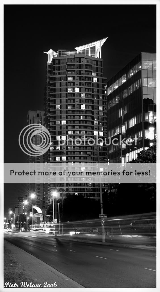
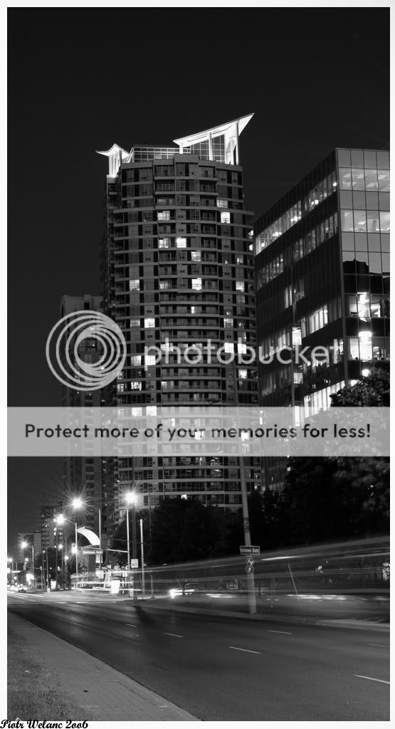
So I first only studied your b+w version WITHOUT scrolling down to the colour version and thought: "Wow, very detailed, super tones, everything comes out perfectly!"
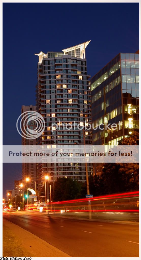
Then I went to the colour pic and do agree that the sky is very nicely coloured here, and the car lights form a good opposition - but I still tend to appreciate the crispness and the tones and the clarity of the b+w version more.
 
First of all, I would rotate the pics just a little bit to the right, because you don't have the building vertical (it's a little tilted to the left).

This is a great shot.
I love the B & W version.
You have great tones and light and everything. It has a story of it.
The colored one... says nothing to me.
 
this better, i used the crop box to check it the biuldings are straight and they are , but it looks slanted to me still, maybe its biuld like that? lol

Biulding1blackandwhite2.jpg
 
I seem to like the b/w better
i don't know why
but great shot! color and b/w are both excellent
 
I like :D
I'd go with the black & white also.
 
I am going to have to agree with the b & w version myself! Nicely done.
 

Most reactions

Back
Top