So you have given us your "OTE" (okay to edit), I understand?
OK, I worked on three of these, first, third and fouth, and all I did in the first is pulling a bit on the curves to make it a bit darker ... shifting the highlights was too risky, since part of the petals are already almost blown out as they are here. Plus I gave the pic a tiny crop from the right and above to shift the blossom a bit out of the very centre of the photo:
I also played with curves in the jackdaw-pic and darkened it a bit, upping the highlight just a teensie-weensie bit. And I shifted it a tad towards more yellow:
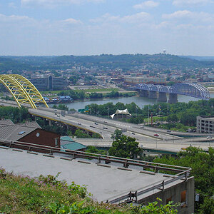
This one was trickier with its very bright spot (blown out, actually) in the background and the comparatively dark banks in the front. I lassoed parts with ... now how do I say that --- it reads 180 px in my bar up there, so that is my "feather"? OK, did that for various parts of the pic to work on those individually. I upped the midtones of the bank but tried to make the bright spot a bit darker, but that no longer works, I think.
Plus again I tried to bring out the greens by upping the yellows just a little, with a sprinkle of red given, too.

now I have told you how far I personally can only go in Photoshop, there are specialists here who can do a lot (!) more than I can, they can work with layers and all that ... that is still far beyond me, though. But you might like what I did, all the same?



 Crows are awesome, I cant get close enough to get a good shot of one! Nice job

 . Best would be a pic of one of those on a headstone, preferably a cross, though


![[No title]](/data/xfmg/thumbnail/39/39448-28e9a5e96080f7edcaf8e4226d8a0a6c.jpg?1734173539)