What's new

Not sure about this picture, what is missing

BastiaanImages

TPF Noob!
Joined
Nov 23, 2011
Messages
221
Reaction score
12
Location
Haarlem, Netherlands
Can others edit my Photos
Photos NOT OK to edit
I took this shot a couple of days ago and I'm not sure about what is missing about it, it feels not 100% good. I like the atmosphere in the shot but I would like to know your comments.
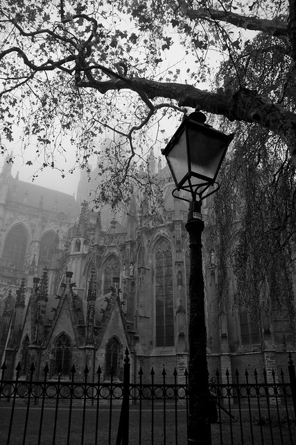
Cathedral by BastiaanImages, on Flickr
 
Honestly? I find myself caring nothing about the light post and wanting to see more of the church shrouded in fog...

I think if you would have gotten away from the tree and the light post and concentrated on the structure, it would have been more aesthetically appealing.
 
Your eye will go to the brightest section of an image or the area of greatest contrast, so the eye goes to the sky and the tree, which is NOT the area of interest
 
I'm really new to the photographing of street/buildings. Usually it's just cars.
 
The building is what I want to see.
 
it also appears to be underexposed by about a half stop.

+1 on no light post
 
It appears you forgot to photograph the ground. At least for me, fences and such are like legs, I don't like seeing them cut off with no joint or endpoint being in the photo.
 
I agree with the others: Lose the lamp or put it way off to the side of the composition as a framing element. It could even be sliced in half in that use and I don't think it would hurt at all.

Also, you might want to think about using a tree like that to frame the shot of the church without much of it being in the frame as well, rather than to take up so much room in the composition the way it currently does. Beyond that, I'd work on using DOF to throw focus to the church by keeping the foreground elements more OOF.

As is, my brain says this is a picture of a lamp post... that's lost all detail... under a tree limb... in front of an iron fence... and there just happens to be a really cool example of architecture behind it that I'd love to see a photograph of.
 
Colour is missing. There are insufficient tones to make it an acceptable black and white.

skieur
 
Personally, I like the image. I think it's a cool shot.
Gothic looking. Someone will always be able to find something wrong with an image, but I think this is a good shot.
Of course, I'm not lookin at all the technical crap, of how I would like to see the image done. If I were you, I'd go back and do it again.
The same way, only this time anchor the lamp post and the iron fence. Rather than clipping them. I think this would make a difference.
 
Thanks everybody for the tips, sadly i cant easily redo the shot as the location is 100km from my house
 
and, at the other extreme...

i found myself wishing it was just fog in the back and no church.

i thought the tree, lamp, and fence looked great against the fog.

and then that annoying building was fighting for my eyes attention.
 
It's a very nice mood. What I think others are sort of dancing around is that it sort of lacks a subject. Sort of. Or, it has one, but as some have pointed out, the subject doesn't allow people to emotionally connect with it.

Good eye for the mood, though. Really very neat.

Lean a person up against that pole or something and I think you have it.
 

Create an account or login to comment

You must be a member in order to leave a comment

Create account

Create an account on our community. It's easy!

Log in

Already have an account? Log in here.

New Topics

Back
Top Bottom