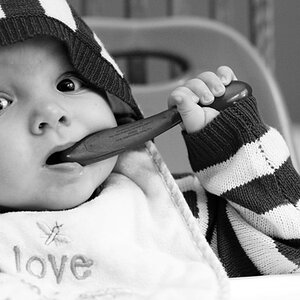
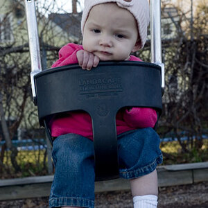
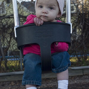
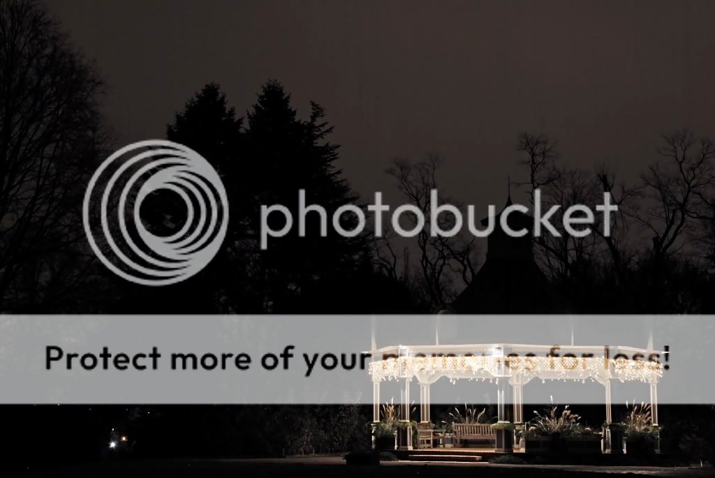
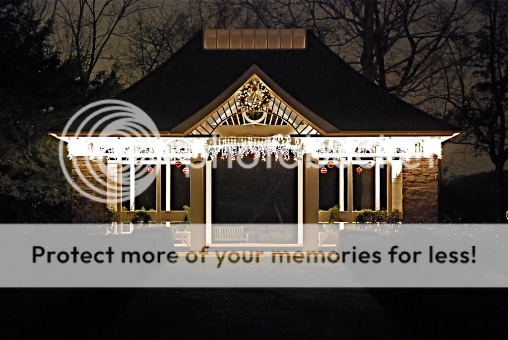
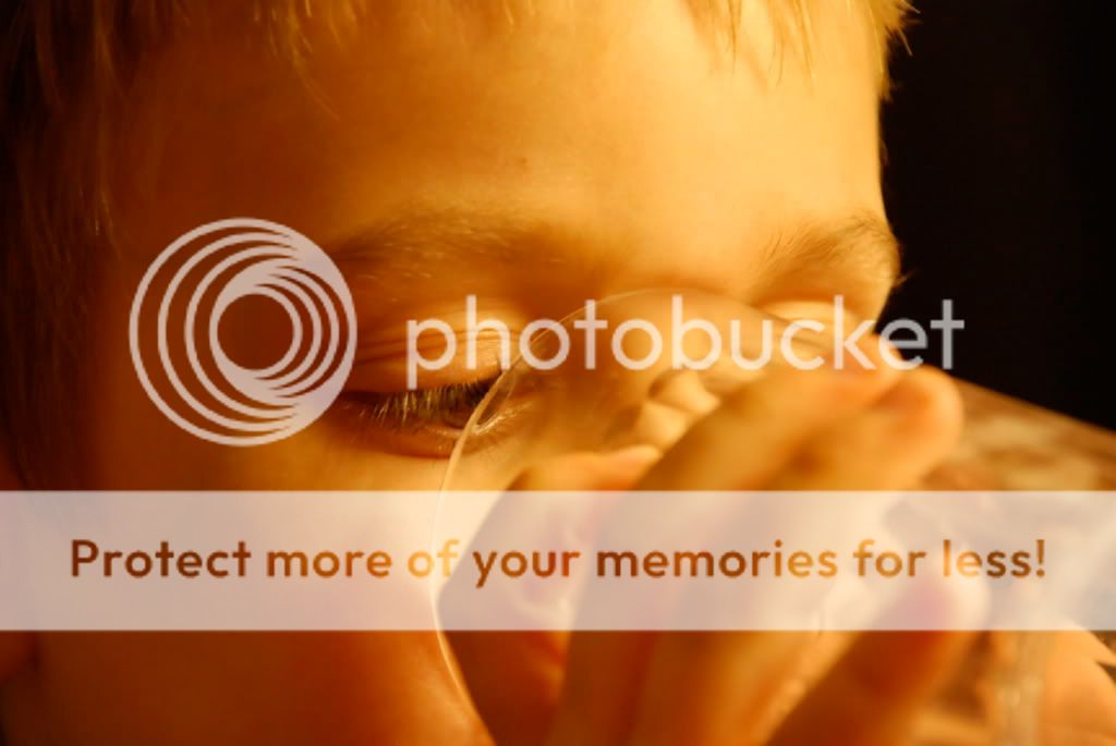
like the first one...dont know why....i think it would have been a lot better had u cropped it to have equal amounts of darkness on each side done like a landscape with it...the second one doesnt work at all for me...the lights are way to overexposed...and the one with the kid i really like...fingers are blurry but the face is sharp...and lets face it that what we would want sharp....haha lets face it...thats funny

![[No title]](/data/xfmg/thumbnail/40/40286-86401b94de8b01bea8bb4ea154aaea0a.jpg?1619739408)

![[No title]](/data/xfmg/thumbnail/37/37526-bc41ead4d3f2330d3e37da95abf9132e.jpg?1619738130)
![[No title]](/data/xfmg/thumbnail/40/40284-f59f6230f0d5b9eacf977f8b0392f087.jpg?1619739407)