very nice series! my fav is #7, not for the selective coloring, but for the scene. the placement of the worker was paramount to this image working. i would love to see it in all b&w.
And at long last, even Corinna gets round to looking at your photos .
You went on your urban-photography-excursion with me on your mind :blushing: Awwww!! :hug:: for that!!!
Ooops. Can't continue commenting, must run the daughter to her Saturday morning training unit in the pool :shock: I'll be back for more!!!!!! For sure!!!!!
OK, back to commenting (actually many hours have passed and I have not only taken my daughter to the pool, but been out taking ... guess what? You're right: PHOTOS! , cooked lunch - which is the cooked meal in Germany -, daughter got collected by her dad, myself been to choir practise, went to take some more ... guess what? Right again! Photos! ... and now I am here).
The church is pinsharp and the b+w conversion looks perfect on that one. I also like your framing and perspective of that.
But the interestingly distributed reflections and the "positioning" and framing of the highrisen houses appeals to me MUCH! Very much! I cannot see where there once was another street light! I tried to find the spot, but you did a good job on cloning that one out, I say.
It does not surprise me why you left the pink house front in colour :greenpbl: ... Funny find. Well framed too!
The next two don't thrill me soooooooooooo much, but I still like them, but then we get into Chinatown, and my novel also takes the main character into there at one point, so I am glad I can now combine what's written there with a picture of how it really looks like. Goodie
Your camera has an INBUILT selective colouring function?
Would mine have that, too?
I don't know... never tested that, but your "mistake" actually turned out into quite an interesting photo --- about the strongest of the series, with the person pushing that thing there ... is there a special word for these kinds of things? Barrow? Trolley?
Yes, the reflection in the street light is nice, and the symmetry in that picture is appealing to - to bring this out more, I might have cropped the vertical pic into a horizontal one, losing the entire bottom of the house and a bit of sky, I think...
Good eye to see the windows in the window!
The reds of the house, however .... ugh! Clashing colours, eh? Shudder! Nice pic, all the same!!!!!
Will you go out and about your city more and take more pics of places that I only know from my crime novel?
guys and gals, thanks a lot for the response! i really appreciate that
Corinna: First of all, I love your long comments
for the second pic, i ended up making a third version. the sky was gradiated (?) so it was a pain removing the lamp... i used all the tools i knew and still, the results were awfull. what i did finally was the elementary way: i selected the whole sky area, put the contrast and brightness to minimum and filled it with a blue i picked from the middle of the original sky... But i'm still working on getting some gradient in there cause it looks kinda artificial to me
Actually today i was planning to go to the Mont-Royal cemetary... never been there before and i never tried cemetary photo, so i'm all excited again
To get there i still have to go through downtown and i'll pass a few streets away from the Grand Seminaire, so maybe i'll drop by and shoot a few. But then again, i can do that any other day cause hey, it's the same building as my school! (and one point for the college!)
Oh, and JM, here ya go for the full b&w!
Imo, it looks nice but i prefer the original... this one seems flat and lacks detail, i think... Also it looks calmer and doesn't convey the lively atmosphere of chinatown, i prefer it with the reds. but i dunno, maybe it's just me. What d'you think?
Ooh, I like this one Alex. Better than with the reds, I think. =) It just seems to have a more...street..ish...feel to it. I would bump the contrast up a tad bit though. =)
true for the contrast, jon. well, if you feel like doing it you sure can play with it... i've been having these pics in front of me for hours now and i'm getting fed up, lol

 .
. , cooked lunch - which is the cooked meal in Germany -, daughter got collected by her dad, myself been to choir practise, went to take some more ... guess what? Right again! Photos! ... and now I am here).
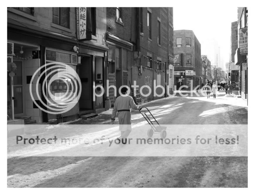


![[No title]](/data/xfmg/thumbnail/38/38739-1ad36a46750bafbe805f009b4453e8be.jpg?1619738703)

![[No title]](/data/xfmg/thumbnail/32/32710-b10dfc8ee698235cdc1e7572139173e8.jpg?1619735614)
![[No title]](/data/xfmg/thumbnail/32/32706-50b778fbc110c8ea4472547d54c6a923.jpg?1619735610)
![[No title]](/data/xfmg/thumbnail/32/32709-80f0f0432fd5ec548a3efdb60ef77d46.jpg?1619735613)