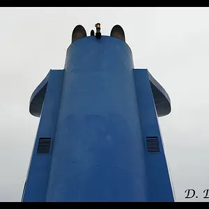
I think #4 would be great if you spent some more time in PP. Also, maybe chop out the palm tree.
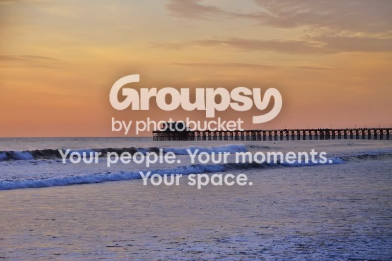
The composition in the others is poor. #1 has the horizon cutting the pic in half and the subject is almost dead center. There's not much detail in the subject either, which makes it less interesting. The pier is interesting and I think you could work with that.
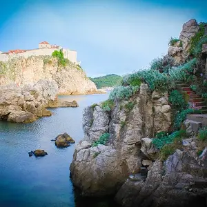
The rocks in #2 bother me... they create too much deadspace at the bottom of the frame. and seem to separate the left from the right, allowing my eyes to kind of fall of the sides of the pic.
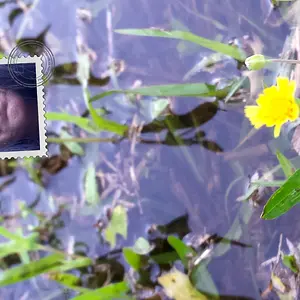
The sky is blown in #3. Expose for the sky, recompose your horizon, and lower your POV, and I think this one would be good.