Office Abstract 2 and 3

sm4him

In memoriam
Supporting Member
Joined
Oct 4, 2011
Messages
10,726
Reaction score
5,467
Location
The Beautiful Hills of East Tennessee
Website
sm4him.500px.com
Can others edit my Photos
Photos OK to edit
I'm working on doing a whole series of these "office abstracts," taking ordinary, mundane parts of the building where I work (or ordinary items in my office) and looking at it differently.

The first Office Abstract was some colored paper in my office and can be seen here.

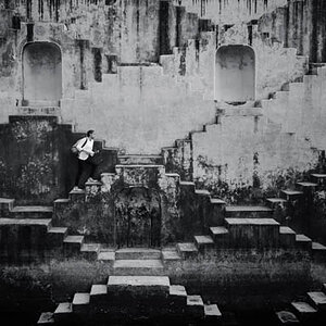
Here's #2 and #3--I already posted #2 in the Abstract/Minimalism thread as well, but wanted to save #3 for this thread.

Office Abstract #2

Oct18_7311editweb by sm4him, on Flickr

Office Abstract #3

Oct18_7319editweb by sm4him, on Flickr

As always--C&C, general comments and witty banter are all appreciated!
 
I loooooove the first one Sharon! I saw this in the minimalist thread and meant to comment but something shiny must have passed by ;) The second is nice too but that first one.... yum!
 
I loooooove the first one Sharon! I saw this in the minimalist thread and meant to comment but something shiny must have passed by ;) The second is nice too but that first one.... yum!
..............SQUIRREL!

;)


I agree, these are great. I especially like #1. Good eye!
 
Ha John! Yep squirrels qualify as shiny around here, that glint of movement in the corner of the eye... just as distracting if not more! ;)
 
I think the first one is the stronger of the two...clean lines, great geometric shapes, lovely colors. Very nicely done, Sharon!
 
Thanks all! So far, it sounds like the consensus is that the first one is the better of the two. That's actually encouraging to hear because that first one is something I've shot probably three times before and this was the first time I finally felt like I *got* what I was seeing in my head from the shot. It's a spot right next to a HUGE span of window and so the amount and angle of light is constantly changing.
 
I love everything about the first one. The color, shadows, shapes, etc.
 
I like the second one. I might like it even more if it were somehow made to be more ambiguous.

I once worked for a man who could take pictures that I could not tell which way was supposed to be "up". The worst part is that they were intended to be "record" shots. :lol:
 
I like them both, but #1 is the clear winner.
 
The first one is superb. I particularly like it on Flickr on the black background, seems to set it off more.
 
Very sweet images. A pleasure to rest the eyes upon.
 

Most reactions

Back
Top