C&C per req:
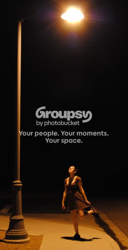
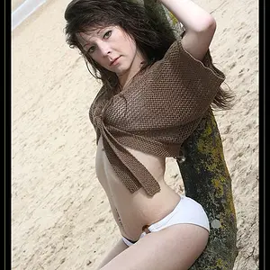
1. I really like the idea of this image, but I'm not sure the execution works as well as it could. First off, since you can't follow the light standard all the way around to the actual light, I'm don't believe having it in the picture really adds anything; I would suggest a 3:2 (1/3 taller than it is wide) portrait crop which makes the woman much more the subject. Technically, I can't say for sure whether it's motion blur or missed focus, ('though I suspect a little of both) but the subject is not sharp, and, you need to adjust your white balance; Na lights give gawd-awful colour casts.
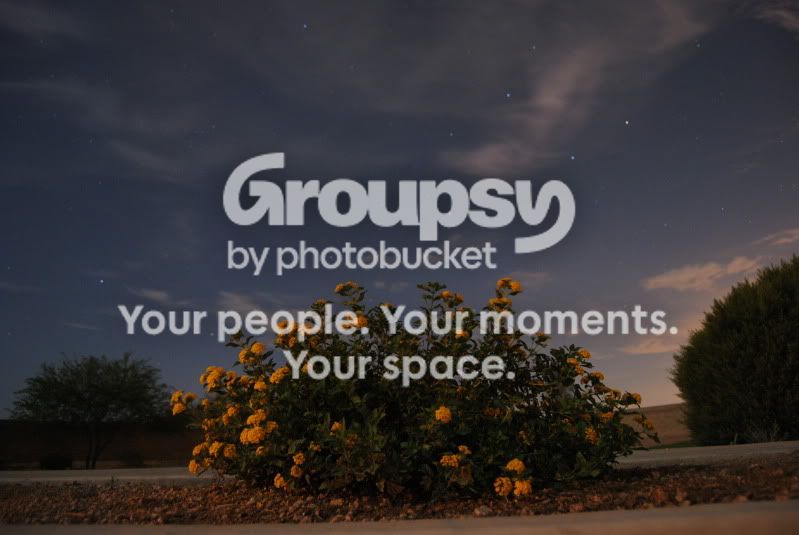
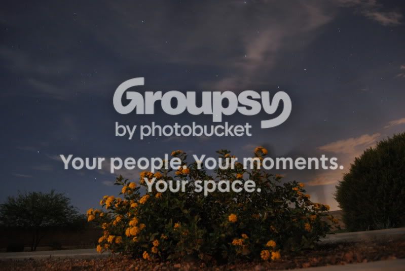
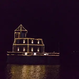
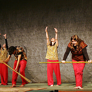
2, 3. I'm afraid I don't get much from either of these. Both are very under-exposed (1 1/2 stops +), the horizons are significantly tilted, and I'm not really seeing a main subject. What was your intent here?
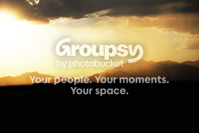
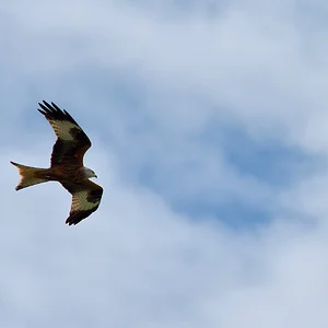
4. Very nice scene; I would suggest cropping some of the bottom off as the black area adds little to the image. As well, while you've done a good job of tricky exposure situation, it's not quite there; you've got some blown highlights image left. For things like this, it's often best to bracket by a 1/2 stop or more. Also, if you like sunrise/sunset, consider the acquisition of graduated neutral density filters.
Just my $00.02 worth - your mileage may vary.
~John