What's new

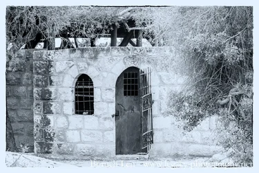
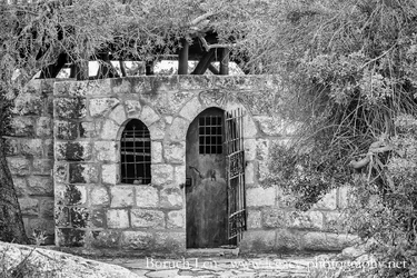
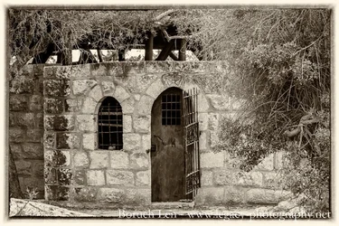
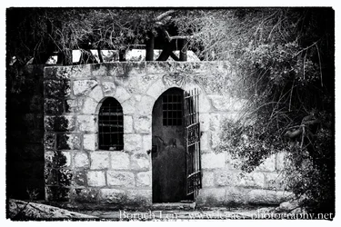
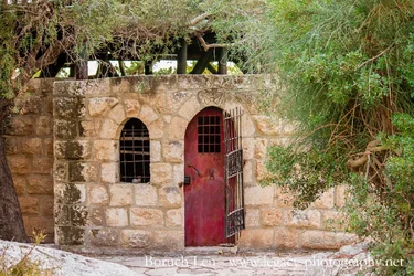
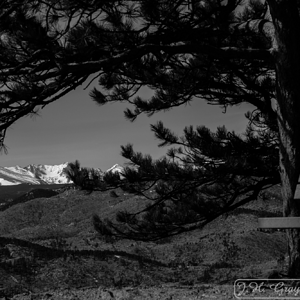
Old door - better in B&W or colour?

Which is the best?


  • Total voters
    14
  • Poll closed .

Tight Knot

No longer a newbie, moving up!
Joined
Nov 30, 2010
Messages
1,398
Reaction score
159
Location
Boca Raton, FL
Can others edit my Photos
Photos OK to edit
Hi all,

Here are a few different versions of the same shot.
Which do you prefer (if any)? Plus, C&C on the image itself would be greatly appreciated.

Thanks so much.

Bruce
 

Attachments

  • Old door and barred window - Cool effects plus border.webp
    Old door and barred window - Cool effects plus border.webp
    359.6 KB · Views: 202
  • Old door and barred window - Full contrast and structure.webp
    Old door and barred window - Full contrast and structure.webp
    477.8 KB · Views: 190
  • Old door and barred window - Sepia plus border.webp
    Old door and barred window - Sepia plus border.webp
    414.9 KB · Views: 233
  • Old door and barred window B-W.webp
    Old door and barred window B-W.webp
    368.2 KB · Views: 249
  • Old door and barred window.webp
    Old door and barred window.webp
    452.5 KB · Views: 207
Keep the original color has a meaning. shows the main theme and discover its meaning in my opinion
 
I voted for #3, although you can't go wrong with any of these interpretations.

To me, the section of wall to the left of the dark stripe near the window doesn't really add anything. I might also darken the very light areas behind the trees just a bit.
 
All b&w look way over processed. Colour is good
 
Last edited:
2, then color.
 
among all collor looks more pleasant, with some vignetting would work for me
 
Color breathes life into this shot
 
I prefer the colour version overall and of the B&W samples the sepia.
 
I voted for #3, although you can't go wrong with any of these interpretations.

To me, the section of wall to the left of the dark stripe near the window doesn't really add anything. I might also darken the very light areas behind the trees just a bit.
Thanks KenC, I'll have to play with them and see.
 
All b&w look way over processed. Colour is good
Thanks Timor. If you would have made this B&W, which would you have gone with, and what would you have done differently?
 
Color breathes life into this shot
Thanks oldhippy, Do you find the B&W's are all too flat and dead? Is there anything else in the colour that you would have changed?
 

Create an account or login to comment

You must be a member in order to leave a comment

Create account

Create an account on our community. It's easy!

Log in

Already have an account? Log in here.

Back
Top Bottom