Old Photo

PixelRabbit

A naughty little bunny...
Joined
Nov 28, 2011
Messages
6,593
Reaction score
3,719
Location
Ontario
Can others edit my Photos
Photos NOT OK to edit
Every month I go back through and review all of my images for that month to see if fresh eyes catch anything I may have overlooked, quite often I find shots that tweak my interest and this month this was the one that stood out.
When I first started to process this shot it was feeling forced and I set it aside, upon seeing it again I saw an old photo so I went with it and embraced it's flaws, to me it feels like it comes together with the noisier processing in a way that it wouldn't with the noise reduced.

Would love to hear your thoughts, thanks for taking a look!
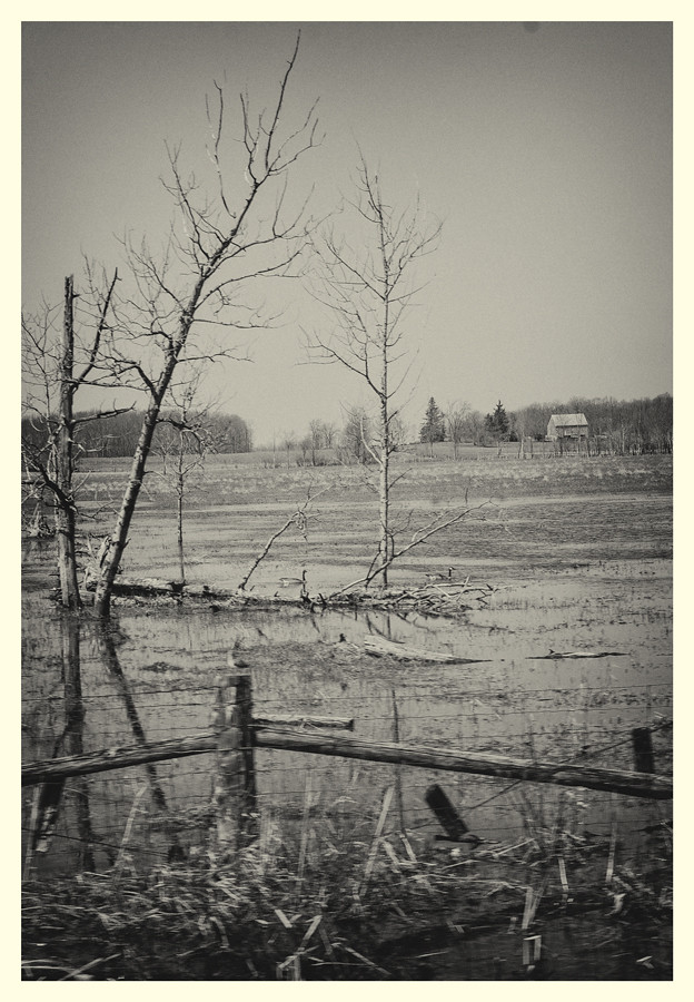
 
Oops, forgot to add that this shot was originally taken for the Postcard theme for the Photo Challenge last month.
 
Morning coffee bump.
 
I can easily see this being an old image..... someone looking at it and remembering the flood at the farm back in '47.
 
Thanks Sparky :) since I had partially processed it when I saw it with fresh eyes it really stood out and I liked the choice I originally made to go this way.
 
I routinely browse through my archives and 'see' a shot in a new way.

Thankfully, I learned to shoot raw quite a while ago so creating a new 'look' is not an issue.
 
The reprocessing of this to look 'old' fits into a blog post I am working on - hope to get it out soon and will let you know.

The dust bunny at the top margin doesn't fit.
 
There are definitely things to like here, but the softness in the foreground is a problem. I think it would actually be better if it were soft throughout, making it look more like a lens defect or even a pinhole shot, rather than what appears to be too-shallow depth of field here.

Recently I have been really pondering the ideas of "Balance" and "Unity" (I didn't make these words up, they're standard terms in the right sorts of texts) and this one seems to be fairly well balanced, to me. The lines are playing pretty well together, there is a reasonable balance of sky versus land, the building is well suited and is balanced by elements in the lower part of the frame.

What I am not feeling is "unity", it does not feel as if the elements of the frame are pulling together in one direction. There's a randomness here, and a lack of hierarchy in the elements I see in the frame. The little bird on the post, the fence, the building, the trees, all feel about equal in importance, and there's nothing particularly emphasizing one and subordinating the others.
 
I routinely browse through my archives and 'see' a shot in a new way.

Thankfully, I learned to shoot raw quite a while ago so creating a new 'look' is not an issue.
Agree about raw, I'm glad I started shooting raw right out of the gate, I'm enjoying the freedom it gives me now :)
The reprocessing of this to look 'old' fits into a blog post I am working on - hope to get it out soon and will let you know.

The dust bunny at the top margin doesn't fit.
Cool Lew, looking forward to reading it. I thought the dust bunny was small and unobtrusive enough to be a neat tiny element but point taken.
There are definitely things to like here, but the softness in the foreground is a problem. I think it would actually be better if it were soft throughout, making it look more like a lens defect or even a pinhole shot, rather than what appears to be too-shallow depth of field here.

Recently I have been really pondering the ideas of "Balance" and "Unity" (I didn't make these words up, they're standard terms in the right sorts of texts) and this one seems to be fairly well balanced, to me. The lines are playing pretty well together, there is a reasonable balance of sky versus land, the building is well suited and is balanced by elements in the lower part of the frame.

What I am not feeling is "unity", it does not feel as if the elements of the frame are pulling together in one direction. There's a randomness here, and a lack of hierarchy in the elements I see in the frame. The little bird on the post, the fence, the building, the trees, all feel about equal in importance, and there's nothing particularly emphasizing one and subordinating the others.

Thanks for your thoughts Andrew, I'm going to take some time and ponder them before I really reply :) I will say that my first thought was I like the lack of a strong important element and feel like it allows me to comfortably look around at all of the elements without my eye being drawn strongly back to an area.
 
I totally meant to get back to this thread sooner than now, I assure you I didn't ponder this long lol

Andrew, thanks again for your thoughts, they all pretty much crossed my mind when I was done with the shot and was C&Cing it myself (I try to find things that people will pick out as errors etc... before I post)
First I'll answer to the blurred fence in the foreground, I knew that was going to meet scrutiny and likely bring negative comments, blurred foreground has been something I've been playing with and I like it here, I think it has an effect of sending your eye up and into the rest of the scene, the only thing I don't like about it is I kinda wish the bird wasn't on the post. I've tried this a lot of times and a lot of times it has felt wrong and ineffective, here I feel good about how it meshes with the rest of the image.

Lack of a strong subject,again this is something that I've been playing with, there are so many gorgeous scenes I see as we travel around but so many don't have a definite strong subject. This got me thinking that the totality of the scene perhaps can make up for the lack of a strong subject that draws your eye back to or everything leads to. I find this comfortable to look at and it lets me comfortably find the smaller details like the geese, water, lines, barn, there is so much to enjoy, perhaps if something was defined as the main subject it wouldn't be as comfortable?
spe
May I ask Andrew, do you remember your first initial reaction to the image before you started to look with a specific critical eye? Did these things stand out to you or was it after you looked around for a bit that they stood out? Just curious :)
 
I think I thought something like this:

Nice vintage feel, interesting stuff... Nice lines... hmm.... a bit disorganized (regarding the trees and the fenceline)

And then I would have started digging in to the details. So, I like the textures and the toning, the lines sort of start to come together for me, but not quite. I approve of stepping away from "subject" a bit. I am currently working through some ideas on that. The idea of "subject" as central seems to be a pretty new one and one that photographers are more obsessed with than anyone else.

Look at Joseph Mallord William Turner's landscapes (and, probably, any other painter's, he's just the guy I am looking at these days) and see if there's a subject anywhere? You'd be hard pressed to identify it, and say 'Aha, this is a picture of THAT tree' or whatever. The pictures are much more holistic than that. The subject, if anything, is the entire scene.

There IS, however a strong hierarchy of importance. Some things are emphasized, others are de-emphasized. The most obvious thing may simply be a patch of light that surely is not the subject, but it's clearly a thing you're supposed to look at. Perhaps it's where you're supposed to begin looking as you take in the whole scene element by element.
 
So here's a concept. All I have done is burn and dodge pretty heavily staying.. well sort of staying .. within the original lighting of the picture.

All I did was essentially chop the thing up into biggish regions and shove some down to darker tones, and bring others up. The light in the sky is faked, and reflected in the water. Then I picked out some random bits and pieces of interest to brighten up.

Take a look and I will write up the concept in the NEXT reply, so I don't pollute your reading of this version too much.

$foo.jpg
 
The CONCEPT is this:

by creating a region of darker or lighter tones, we tend to unify the stuff in that region up, they tend to visually "group together" more. By dropping small bright elements into the darker regions, and vice versa, we accomplish two things: we visually connect the large lighter areas to the large darker areas, and we create variety/interest.

I brought up the building and some areas on the foreground fence as these little light spots. The reflected "light" in the water, the building, and the streak of white on top of the fence rail make a nice little triangle of white spots, and there's some echoed line in there to boot (this is a total accident, but I like it). The largest tree serves as a little bit of dark in the sky's light. I placed the sky light against the darkened trees on the horizon to give a little more visual pop, a little contrast and interest.

I strengthened the line of the biggest tree by echoing it in the spread of light in the sky (that was an accident as well, by the way, although I WAS aiming for a diagonal)
 
Thanks so much for coming back to this convo Andrew, I appreciate your thoughts.

I see where you are going with your edit and it has me thinking around this concept more with the light, I really like the idea of using it as an element and often I try to in other areas (like my most recent flowers).

Your edit has hit the mark in a lot of ways and I will definitely carry it forward into other work, I like it as an option here and I see how it changes the image significantly, it gives it a depth that it didn't have before (which was intentional). Here was my thought in making it flat, it is the flatness that really takes it to the "old photo" place for me BUT it might be a regional thing perhaps? Whenever I'm out at the markets, curio shops etc.. in the area I always look for the box of old photos that is always there and go through them, one thing that very often stands out to me is they are flat with more even tones, low contrast. I was trying to get to that place with this shot and I'm happy with where I ended up, I agree that your edit with the light renders a "stronger" photo but it's missing the mark I was trying to hit here, I would say that I like both ways and you have definitely opened my eyes and given me a better direction with this concept of "no strong subject" and options to integrate (cloudy with breaks here I come!)

I really am dragging my feet on learning all that I can on editing and I have no clue why, I'm not sure that I would ever add light as done here for illustrative purposes but I definitely need to get up to speed more so I can tweak things, it's the small things that so often make the biggest difference IMHO.

So thanks again for the time you spend on this Andrew, I really appreciate it, I love getting inside someone's head and finding out how my images first hit the brain and the extra thought you have put in is the bonus round!

Oh! and Joseph Mallord William Turner ZOMG LOVE LOVE LOVE!! He totally twirls my beanine! How inspiring, thank you for pointing me in his direction!
 

Most reactions

Back
Top