One from the cemetery

BlackSheep

No longer a newbie, moving up!
Joined
Feb 6, 2011
Messages
1,580
Reaction score
230
Location
Woodbridge, Canada
Can others edit my Photos
Photos OK to edit
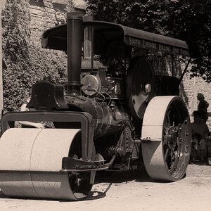
Went to the oldest cemetery in Toronto today, here's one shot I got:

DSC01050.jpg


Comments always welcome :)
 
I like both, #1 in particular – then again, I'm a sucker for semi-abstract stuff and also for found symmetries/almost symmetries.

I can't help but think that both of these would shine in B&W, mostly #2 – then again, I think I'm always biased towards B&W :)
 
BW might be better or might be less interesting than the subtle colors in these - hard to tell without trying some conversions. I guess my inclination with stuff like this is to get closer and more off-center, but those would be different images and possibly of less interest to those who are not me.
 
Thanks for your comments, invisible & Ken!

Yep, for these two I was going to switch them to B&W, but they didn't work as well as I had thought they would:

bwDSC01050.jpg


bwDSC01047.jpg


The colour versions are more interesting, at least to me.

invisible, normally I am also biased towards B&W :) The other shots I got yesterday got converted, like this one:

DSC01030.jpg
 
Last edited:
Gravestones were much more beautiful in the old'n days. I want something like that... with a tree growing next to it... with flowers... with a candle...

b/w ftw ;)
 
Thanks Compaq!
The name of the cemetery is "Necropolis". There's some really neat history in there, early Prime Ministers and the like. One grave we found was from the late 1700s, before Canada was even a country.
 
invisible, normally I am also biased towards B&W :) The other shots I got yesterday got converted, like this one:

DSC01030.jpg

You're not fooling me ;)

Now for the real B&W conversions :): I think the lion needs a tad more contrast to really shine; the other image, however, is much more interesting to me in B&W than in colour – but maybe it's just me.
 
Hahaha! Busted!!! That last one that I posted isn't the B&W conversion here on my computer, I was messing around with the Photobucket "B&W conversion" to see what it did, and posted that one as it was handy. Here's the actual B&W version I've been working on:

bwDSC01030.jpg


Thanks for the feedback on the lion B&W, I'll try bumping the contrast a bit later. For the first shot you like the B&W better? I keep changing my mind about it. Right now, I think I like both versions, they are quite different in their mood.
 
For the first shot you like the B&W better? I keep changing my mind about it. Right now, I think I like both versions, they are quite different in their mood.
Yes, definitely the B&W version for me – I think it emphasizes the shapes and the textures much better. Plus, going by your (seemingly desaturated) images, it looks like there was't much colour there to begin with.

As for the B&W image you just posted, I also think that it works better than the one with selective colour.

Just my personal taste, I guess :)
 
You are right, there wasn't much colour to start with on the first two (no desaturation done there).
And yep, the third one will remain in actual B&W, I don't like the "Photobucket experiment" version myself.
Thanks again for the feedback :)
 
Last edited:
If you want to add a sad tone to death, the originals are the choice...and if you want to take death brilliant-a more wise approach- the B&Ws work better... but the very mood of the lion is melancholius; i really liked the tombstone image :D
 

Most reactions

New Topics

Back
Top