Frequency
Been spending a lot of time on here!
- Joined
- Oct 17, 2010
- Messages
- 8,864
- Reaction score
- 683
- Location
- Calicut, Kerala,India
- Can others edit my Photos
- Photos OK to edit
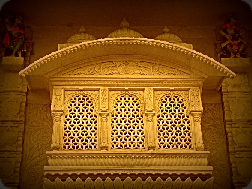
I like the top photo better, It seems to have a warm/glowing effect
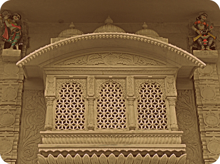
A good analysis; thank you very muchI don't know if I'd say one is *better* than the other, they are just very different. The first one, the focus is all on the...umm, structure--I don't really know what to call that!--and I kinda like how the yellow tone really sets the lattice work off.
In the second one, my eye is suddenly drawn a little more to the little figures up in the top corners--I hardly even noticed they were there in the first one.
Thank you very much FB; i too had a concern regarding vignetteSince you included the detailed figures in your composition, I would avoid the vignette because it would appear badly exposed.
Thank you very much FB#2, but without the rounded corners.