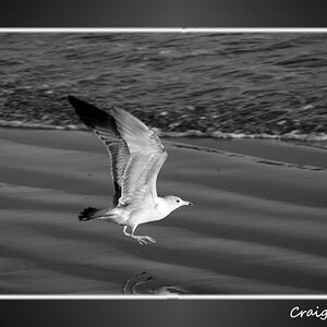
Thank you for the ideas, but I am having trouble trying to visualize what you mean with the blue/green fonts. Wouldn't that just blend in with the sky/grass? Could you elaborate a little more, I'd like to know what you mean.
Okay...? I guess I am sorry that your first post in this thread was unnecessary and uninformed. Also, "/thread"-ing is pretty juvenile. You could have simply apologized for jumping to conclusions, but I guess that was out of the realm of possibility for you.
Unnecessary and uniformed? You may be right...I figured that people posting about which photo should be published in their paper were not noobs and were discussing business, but by the quality, I should have figured out what was really going on.
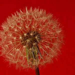
The first photo is nearly under exposed except for the white in the flower, which coincindentally is the only part that is in focus. With the shallow DOF and that section almost over exposed to where you can't make much out, you have a blurry picture of a flower.
The second photo is just boring. The sky is exposed properly...that's about all I can say it has going for it. What might actually apply as the subject of the photo, the brown splotch in the middle, is just a brown splotch. It says nothing about mid coast living...that is unless mid coast living is all about being bland and lacking personality.
That's what I was initially going to post.
But then again, there's this big long thread about how the Noob Toob has become pretty much the only active part of these forums and how it's really killing the rest of the forumd because of thoughtlessness, lack of insight, and rudeness of all the new people that are posting here that shouldn't be or either can't use the search button.






![[No title]](/data/xfmg/thumbnail/32/32926-ec27ecead8c80d803404500d8f888dbf.jpg?1734162683)
![[No title]](/data/xfmg/thumbnail/32/32930-09414fc020c2a60a456ff59a05c5ef8f.jpg?1734162706)




![[No title]](/data/xfmg/thumbnail/38/38264-552eb428d8a704186dcc43400f417d0f.jpg?1734172154)