Opinions on new shots

Jeffro

TPF Noob!
Joined
Jun 30, 2009
Messages
701
Reaction score
0
Location
Louisiana
Website
infinitecustoms.forumotion.net
Can others edit my Photos
Photos NOT OK to edit
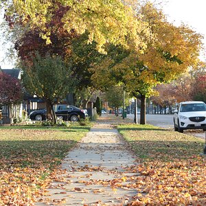
3 New Shots and I would like to know which is the best! I know it is each persons opinion but I am cool with that!

Chopper4L.jpg


Nature4L.jpg

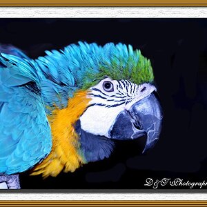
This is my new Favorite Photo

seagulls2L.jpg
 
1. Not level & Horizon distracts me from the silouette of the copter.

2. Interesting exposure, my eye though is immediately drawn to the clump of grass in the foreground, particularily the one large bunch hanging on the right. Can understand trying to frame that there in the foregound but it distracts my eye.

3. Vivid, nice colors but what detail there is looks heavily fabricated from post processing. It's probably motion blur but looks almost like halo'ing to me on perimeter of their wings. Also looks a little off axis from the horizon and the birds at the very bottom in the distance could cropped out. May be interesting crop in the right quadrant but I suspect your fighting for the sharpness you got in PP and that further reduction would soften further.

Overall show good potential.
 
i like last one :) :thumbup: :thumbup:
 
Im a newbie but heres my opinion!
1. Its an awesome shot but on IMO if you got down more and took the photo at a slightly lower level it would be more powerful and the big silhouette would be a little less distracting from the subject.
2. Its such an eerie and awesome shot!. but I think it could be more riveting if there was no large bush on the left side and you got rid of the tree on the right and just left the main tree. P.S. where is that light source coming from? it is night time? ( sorry im a newbie)
3. I love this picture the colors pop and the birds look so lifelike.
 
1. Not level & Horizon distracts me from the silouette of the copter.

2. Interesting exposure, my eye though is immediately drawn to the clump of grass in the foreground, particularily the one large bunch hanging on the right. Can understand trying to frame that there in the foregound but it distracts my eye.

3. Vivid, nice colors but what detail there is looks heavily fabricated from post processing. It's probably motion blur but looks almost like halo'ing to me on perimeter of their wings. Also looks a little off axis from the horizon and the birds at the very bottom in the distance could cropped out. May be interesting crop in the right quadrant but I suspect your fighting for the sharpness you got in PP and that further reduction would soften further.

Overall show good potential.


Ok 1. Am I crazy but it looks level to me?

2. Kinda agree

3. Photo taken a while back with a Nikon P80 and saved as a small file. Looks to have lost a little being saved a number of times. There is barely any editing other than levels and such

Also once again you say it is not level yet there is no horizon in this shot?
 
come on people!!! Let me know!
It's early morning and it's a forum, not a chat room.

Sorry I was excited!!!! LOL


Im a newbie but heres my opinion!
1. Its an awesome shot but on IMO if you got down more and took the photo at a slightly lower level it would be more powerful and the big silhouette would be a little less distracting from the subject.
2. Its such an eerie and awesome shot!. but I think it could be more riveting if there was no large bush on the left side and you got rid of the tree on the right and just left the main tree. P.S. where is that light source coming from? it is night time? ( sorry im a newbie)
3. I love this picture the colors pop and the birds look so lifelike.


1. I understand getting on the ground lower but I was sitting on the ground. Guess I should have layed down. But I am not understanding The big silhouette is the Subject????

2. I kinda Agree and may work with the shot cause it is a tree in my front yard. The photo was taken at 4 in the morning and the light is just a light on a telephone pole in front of the neighbors house.

3. Thanks Its a old shot and my dad loves it! Think I have posted it before but why not!
 
about the first one's horizon tilting, its not the horizon, its that the shot was taken just a slight hair to the left of the middle of the chopper, making it look like that.

Second one would be my favorite and awesome if it wasnt for the clear spot light in the middle of the photo, which is distracting, im sure that can be photoshopped though, i would try for you but no PS at the moment.

Third photo i think its cool but it seems like you did a little sharpening? Maybe just me without glasses :p

gj though bro, keep shooting, i want to see more pics, btw how did the third one happen?

also: how are you applying the signature in the photo?
 
I like them all. I see what they are saying about one and it bieng level. It's low on the left side... Tho it looks like a pretty wide angle too so it could be distortion.
2 I like but would be good to see jst a tad bit more of the tree. Just me.
3 is very nice.
 
about the first one's horizon tilting, its not the horizon, its that the shot was taken just a slight hair to the left of the middle of the chopper, making it look like that.

Second one would be my favorite and awesome if it wasnt for the clear spot light in the middle of the photo, which is distracting, im sure that can be photoshopped though, i would try for you but no PS at the moment.

Third photo i think its cool but it seems like you did a little sharpening? Maybe just me without glasses :p

gj though bro, keep shooting, i want to see more pics, btw how did the third one happen?

also: how are you applying the signature in the photo?


Yeah I have been looking at the 1st one and maybe it is off a little. But I did not notice it as fast as some others

I did try to pull down the center light in CS4 but was not having alot of luck with it!

The third one I edited exposer a little and the colors that it all.
I got the shot in Galveston Tx by the beach by putting popcorn on my head and they would take it off! makes for great close ups! LOL and that is a true story!

I do the Signature in CS4 on a separate layer. I want to find a better way soon.
 
I like them all. I see what they are saying about one and it bieng level. It's low on the left side... Tho it looks like a pretty wide angle too so it could be distortion.
2 I like but would be good to see jst a tad bit more of the tree. Just me.
3 is very nice.

What do you mean? the top of the tree if the light carried a little farther???
 
Here is the original shot Straight out the camera!
INFO

F/4 for 3 sec. ISO 640
18-105 lens
_DSC0010.jpg

I like this one a lot better than the other one. :thumbup:
 

Most reactions

New Topics

Back
Top