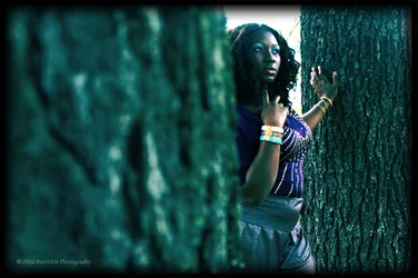
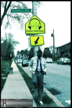
I don't care for the processing on either one of them. Or the composition.
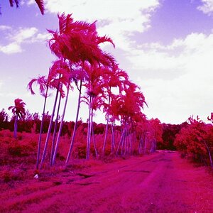
#1 The color cast it really odd, and seriously detracts from the photo. While your subject is framed by the trees, the trees create so much dead space that you subject is engulfed by it. Is the softness intentional? It looks like fake blur.
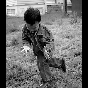
#2 No detail in the subject's face.. way to contrasty. The blown out sky, the odd color cast, the fake blur, the softness, what looks like bad cloning.. none of it makes for an attractive photo. The photoshopped "Loud Music" sign does not even match the color of the other sign.
What were your intentions here?





![[No title]](/data/xfmg/thumbnail/31/31045-f4eb92f5d5eaca89ec5966763eea2dae.jpg?1734159149)


![[No title]](/data/xfmg/thumbnail/31/31709-79016edd1a9f5ea41ef60f546bd0236d.jpg?1734160386)