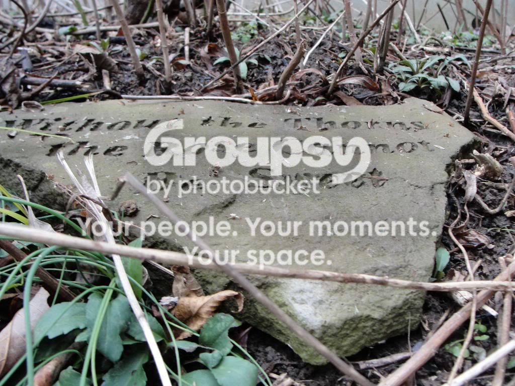
#1- Overexposed and the colors are flat. The composition and framing is awkward. You cut off the right corner of the stone. The perspective is unremarkable and not very interesting. It seems as if you just knelt down and snapped the shot. The twigs in the foreground are distracting and the background is cluttered.
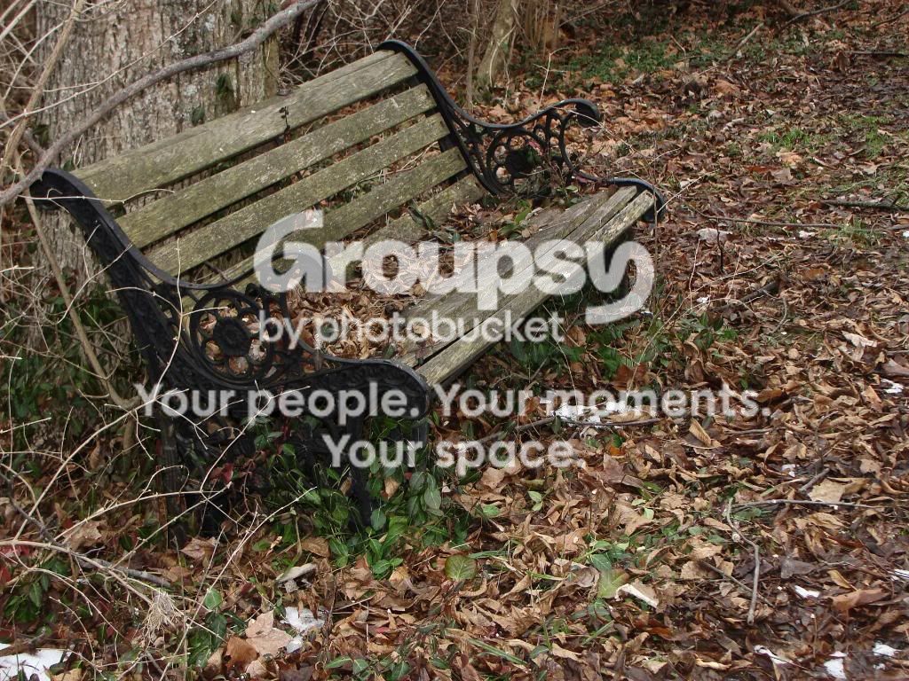
#2- I like the framing but the scene is too cluttered. The colors are flat again. The branches across the upper left corner are distracting. You are responsible for every minute detail included within your frame.
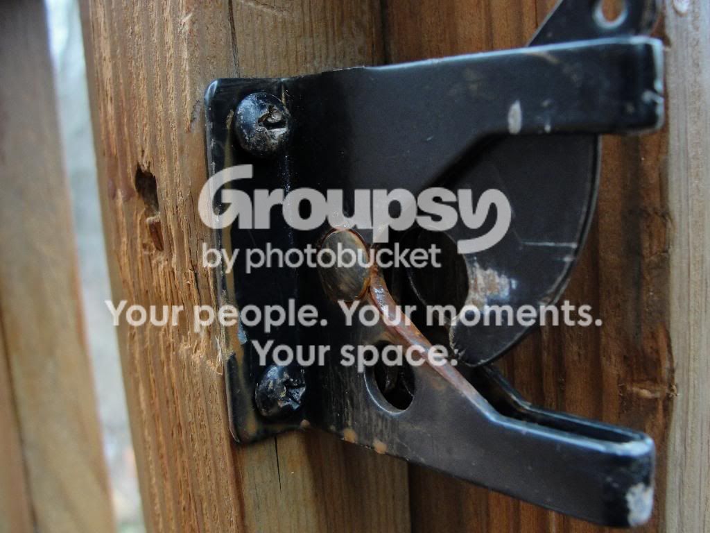
#3- Lacks interest. For me the narrow DOF is awkward with the nearest part of the latch out-of-focus. Makes me wonder, "why did the photographer choose a narrow DOF for this shot?" It doesn't offer anything to the image IMHO and thus seems arbitrary. If you are going to snap a photo of a gate latch show me in your creation why YOU care about that latch and thus why I should care about it.
Just my 2 cents.


 . Yea I agree that the third doesnt do anything. Thanks though.




![[No title]](/data/xfmg/thumbnail/39/39533-c2c39d37e833a4689533c897ace8c348.jpg?1734173682)