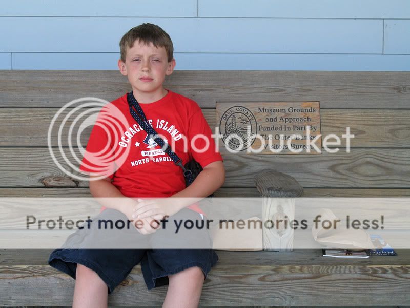
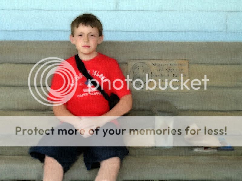
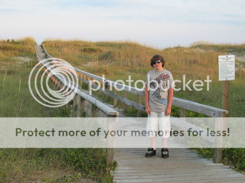
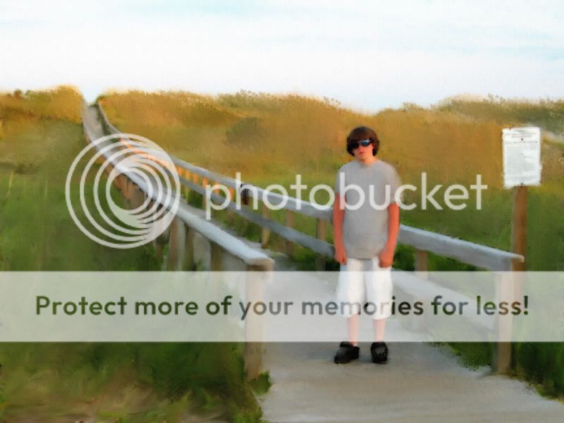
I did these effects with a free downloadable program called GIMP. The first one looks more like an oil painting and the second looks kind of like a water color.
Not a big fan of "paint alterations," but I think the second one could be a cool piece of art had the kid not been in the frame. It makes the landscape look interesting, but makes subject is out of place.
Actually, I could only see someone putting either one of these effect paintings on their wall if the kid actually belonged to them. Which he does. Belong to me that is.
These painting effect pics are for those whose think these kind of effects are neat. Hence the title of my thread, "painting effects, before and after". Anyone else can feel free to bypass them.
Not a big fan of "paint alterations," but I think the second one could be a cool piece of art had the kid not been in the frame. It makes the landscape look interesting, but makes subject is out of place.
I agree. However, if you must have the boy in the picture, it would be more 'artsy' I suppose, if he was sitting on the fence and probably not looking at the camera.
Actually, I could only see someone putting either one of these effect paintings on their wall if the kid actually belonged to them. Which he does. Belong to me that is.
These painting effect pics are for those whose think these kind of effects are neat. Hence the title of my thread, "painting effects, before and after". Anyone else can feel free to bypass them.
The boys body language doesn't fit the picture in the second one. It takes away from the photo IN MY OPINION, because he is hunched over, and has a look like he doesn't even want to be in the picture. Like the above poster said, moving the subject might flow more smoothly with the rest of the shot.
And this logic can be applied to either photo, the edit or the original.
looks neat - i do enjoy the paint treament - in the right context. however, for the second photo, i think that people in them should be close up or portriat style - so their features are large enough for the paint effect, or they should be small enough so you dont try to relate with the actual features of the person - more of just the idea of the people in the "painting"
Although I agree the paint treatment is cool, being an outside and not knowing your son, the second one is akward. However, you already having a relationship with the identity in the photo, probably makes you relate easier than us outsiders. I am new to the forum, but i thought that was what the whole C&C thing is for, to get a better understanding of how other will percieve your photos so you can improve. No need to get upset when asking for others opinions, its not like they are putting you down or anything, they are giving the opinion so you can gain their perseptions and add it to future photos.
For me being a beginner to the hobby - i like the first one, the second one is OK but since it is a beach scene there are a few items that do not fit - had he been bare foot, holding a surf board, or something else - would put it in better perspective to relate to.
These are just experimental photos. I was looking for feedback primarily on the result of the digital effect itself without regard so much as to the composition. I guess I should have clarified that in the intro post.
These effects are not 3 mouse click deals. I had to manually go over them with several different brushes and tools (primarily the smudge tool). Especially the top one. The top one took major manipulation. I actually spent like two - two and half hours doing that one.
If you ask me, in the top set, the painted one looks better than the the photo itself. He looks happier in the painting than in the photo... which is what a good painter is supposed to do for a portrait haha. Improve a little. I think he was getting sick of me taking another photo of him. He's got that 'come on dad' look. I had just gotten that camera back then and I was non-stop trying to snap photos on that vacation.
These painting effect pics look MUCH more realistic in a larger format. I want to get a wide format 13x19 printer and print some of them out on actual water color or canvas paper. I'll find an arsty looking photo to do next. Preferably with some sail boats in it .

") .
.
![[No title]](/data/xfmg/thumbnail/35/35953-1a8b92df0115ff7026f31b78855ac815.jpg?1619737264)