Photo/lighting portrait critique request

gossamer

TPF Noob!
Joined
Dec 24, 2013
Messages
234
Reaction score
23
Location
New Jersey
Can others edit my Photos
Photos OK to edit
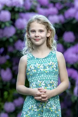
Hi, I took this picture a few days ago with my D500 and 24-70mm at about 35mm and my XPLOR 600 with a 38" octobox. The light was just a few feet away from the subject, slightly above her head. My assistant was holding a silver reflector under the subject at about the waist level.

The picture is missing the catcheye, possibly due to the reflector diffusing the light?

What can I do to improve this picture? Having the light above her is difficult because she is wearing a hat and I was afraid of it creating shadows. I'm going to try again tonight with my 70-200mm lens and hope to blur the background even more, to make it a bit more creamy.

DSC6125-30.jpg
 
Not bad! Right now it looks to me as if the background is about 1/2 - 2/3 of a stop brighter in the highlights than the subject; not a huge deal, but knocking it down that little bit would help. Hats are always an issue; my solution would be to to use an on-axis fill 1 1/2 - 2 stops below key. That will bring in the catchlight and that little bit of 'pop' you want. As far as the background; the more separation and longer the focal length, the greater the unfocused effect will be.
 
More than the lighting, the thing that I find most disconcerting is how large her hands look, compared to her head and face. The short focal length and close camera-to-subject distance has caused what's called "apparent perspective distortion", which is also somewhat like "foreshortening". He hands appear very large,and prominent. This is where shooting with a longer camera-to-subject distance would have alleviated this effect.

You asked, "What can I do to improve this picture?" I think the answers could be several, and it would depending on your post-processing skills and bag of tricks. One thing I think could help might be to use Lightroom's "iris enhance" tool, and give her eyes a bit more brightness,and color, and clarity. And maybe dodge (lighten) the eye socket area a bit too. As Tirediron mentioned, the background is a bit brighter than she is, and most especially at the top of the frame, where her face is; if there's a place that could benefit from some selective dodging and burning,m it would be her face, her ears, and the top of the frame,m above her hat.

I dunno...there are a number of Lightroom presets that could also be applied, any of which might make a stronger final picture. But still,overall it's a pleasant image, and it does not need "a lot" done to it to improve it, but I do think some post-processing tweaks could strength this shot.
 
Frankly, I like the original version better. I think anytime there is a hat involved, you should consider on-axis fill flash. It doesn't take much of a flash to make a big difference under the hat.
 
Thanks everyone for the awesome feedback. Are the LR changes that have been suggested something that always has to be done, or is it something generally that can be done with proper equipment and lighting? In other words, given the equipment I have, should I be able to shoot an image that wouldn't need those LR modifications?

Here's a version I did this evening with my 70-200mm. They're both shot about 135mm. Hands look smaller now? I think the skin color may be a little off. I probably should have used my gray card, but instead just used PS Flash. I inserted thumbnails assuming they can be clicked to be enlarged after posting...

DSC6160-30.jpg DSC6168-30.jpg
 
And what is as on axis an on axis light can be? A ring light. But the on axis can be clamshell instead of the reflector. I prefer a light because I can precisely modify the power and fill without leaving my stool. There is a catchlight from the reflector in the lower part of the eye, but I don't see one from the upper light. Might have tried tipping the hat up slightly or lowering the main. It might get more light in the eye sockets and a good catchlight. Speaking of the eyes, the reflector doesn't have her squinting, but her pupil is smaller than I prefer and using a strobe would correct that. I use the variable power from camera of the einstein 250 watt modeling lights to adjust the pupil size and hence the amount of iris I have to work with. I usually have the modeling light on the main at full power then adjust the fill. Were you going for a butterfly/paramount lighting pattern? I can't see the nose shadow very well. Start building your lights with just the main and raise it too high then lower it watching for light and a catch light in the eye. Using a 35 mm lens as Derrel points out, makes things closer to the camera larger. I would bet her nose is made a bit bigger too and would look smaller at 85, 105 or 135 and you standing further back. Be aware it isn't the length of the lens alone that compresses, perspective is determined by the distance to the subject. If you stood at 10 feet with a 35 and 10 feet with a 135 and cropped them the same, the perspective would be the same. Want to see it in action? You think your face looks like you see it in the morning standing at the sink about 2 feet from the mirror and another 2 feet back to the reflection, about 4 feet or so. Watch your nose and take a set back, it gets smaller. Take another step back, smaller still. I have never had a subject ask to make their nose bigger. Also, unless the dominant in the image hands have a meaning like she is a pianist, perhaps consider a head and torso and the hands on hips providing a triangular base for her neck and head. Or look at the picture within the picture her, cropping mid upper arms. I like it cropped in half way to her arms from each side at the same time. That really brings the emphasis to her face and hat. Cropping to maximize the image not to force it in a standard mat forced me to become a competitent custom mat cutter. Shooting at 135 or 200 mm will give you more oof background and consider moving her further from the bg if you have room to increase it. I would look for a "clean spot" in the bg that is green and free of flowers to locate the hat so it doesn't blend as much with the bg. If you moved her say 20-30 feet from the bg, you might get just a beautiful oof wash of the flowers and greenery. Not sure how close she is to the bg, but I wonder if you are getting some light spill on it that brightens it. Looks like sun is overhead between her and the flowers. Perhaps getting it behind the flowers would take that down a bit. You could also knock down the highlights on the flowers in ps in a levels adj layer pushing in the highlight output slider then painting it in on the flowers on a black mask. Hmm, while you were painting I wonder if you could use that mask to make the flowers the same color as the hat? I agree with the above on eye work could be done in post. Whiten whites, kick up iris. Whiten teeth a bit as well. Selectively sharpen eyes, eye brows, nose and lips a tiny bit, finish with a subtle vignette. Just some things I would consider, not the only way, just my way. How you do it will become your style.
 
Just saw your new post while I was typing mine. You shot at 135 that I recommended without seeing them and take a look at her nose. First, white balance. You can include a white balance card in the first shot then click the eyedropper tool on it in post and bam, correct white balance. Another option is setting a custom white balance in camera before she steps on the set. I like to use a color checker pass port but I have more demanding color accuracy than most. Plus I can start right then precisely warm with the warming patches. I liked the hat color with the flowers but no hat eliminates the hat blending with the flowers in the bg. You have her brighter than the bg in the r hand shot and the bg is darker. It really makes her pop from the image. I still like a crop about mid bicep. If you do want to go longer, the hands together form a huge mass that competes in size and brightness with the head for the viewers attention, which should be the focus of the shot. Also, all those fingers are distracting and not soft. Consider having her stand behind a chair or giving her a flower to hold. Then dont have the backs of the hands to the camera, position so the edge of the hand is. Then have her relax her fingers, no tension. Or hands behind back or on her hips in a playful pose and expressi0n. You know like, Are we done, dad? Keep practicing, we can see the progress.
 
The second photo of the second batch is a great pose and expression. Soooooo much better than the other two frames. A real, true winner! Th second batch has rather cool white balance, but that's down to personal taste, and of course, might be "accurate" based on time of day and location. The rendering of her personage and the background in both of the 135mm captures is sooooo much more-attractive than with the 35mm lens. Getting the camera FARTHER away and using the longer focal length creates so much more pleasing a rendering of a person. Good job! I personally like the inclusion of the clasped hands with this expression and on this type of longer, half-body shot.
 
Thanks everyone for the awesome feedback. Are the LR changes that have been suggested something that always has to be done, or is it something generally that can be done with proper equipment and lighting? In other words, given the equipment I have, should I be able to shoot an image that wouldn't need those LR modifications?

Here's a version I did this evening with my 70-200mm. They're both shot about 135mm. Hands look smaller now? I think the skin color may be a little off. I probably should have used my gray card, but instead just used PS Flash. I inserted thumbnails assuming they can be clicked to be enlarged after posting...

View attachment 158689 View attachment 158690
Every image you see posted by a professional is edited. Your white balance is off on both the original and on the most recent shoot. Shooting a custom wb will fix this but your images will often still need to be slightly adjusted in post (Lightroom or other editing software). There are many different ways and styles to edit but yes, your image should be edited. This was a very quick edit, with a very small file size so it is not going to look "its best". Your original photo, while it might look okay on the computer, would probably print dark so the exposure needs to be brought up at minimal.

When editing you will adjust white balance, exposure, contrast, highlights/shadows, and a whole lotta other stuff depeneding on how advanced you get. I basically have my base edit saved as a preset because I tend to go for the same "look" every time. You can purchase presets, but lightroom comes with a few basic ones. Personally, I do hand/ custom edits with my preset (which is what I used on your photo). If you would like editing advice, feel free to message me!
 
Hands are a whole posing class in themselves and even Michelangelo spent a great amount of time studying posing them as do most painters. The problem I have with the hands here is they are nearly the size of the head, distracting from it and giving them equal importance. That is confusing to the viewer. They are also as bright as the head also drawing the eye and I would prefer there be some fall off by that level perhaps by feathering the light, ie aiming it over the subjects head and allow the fall off down the body. Or adding a vignette or graduated filter in post. In studio, a black net could be used. Adding to the distraction is a similar problem that results when a man puts his hands in his pockets and leaves his thumbs sticking out. They look like a couple of random, disjointed sausages. My favorite image, the right one in the second group has the sausage problem. Also, rather than soft, and gently bent, the fingers are in claw mode which is inconsistent with the youth and gentleness of the shot. There are plenty of ways to deal with this, the easiest is to crop out the hands. I don't see them adding anything to the shot and they give the appearance she or the photographer didn't know what to do with them. Reminds me of a shot a "professional" photographer had of himself with similar hands but placed lower in what I call the fig leaf pose. I am only more annoyed than that pose by the hand touching the head for no reason pose in what I call the "ex wife pose... not tonight, I have a headache." The easy solution is give this subject something to hold and one of the flowers would do that and it would hide the hands or at least diminish their relative size. It would give a connection to the background flowers as well. She could also use it to smell the flower, hold it up and gaze at it, look down at it. Op apparently knows her personality and could use that knowledge for inspiration. It could create a whole integrated series of shots, one flowing from the other. Now if her hands have a special significance, like a shot I took of a boxers hands being wrapped before a fight, then I would want that significance more enumerated. Op is making great progress, keep up the good work. You are practicing with a purpose. Practice doesn't make perfect, perfect practice makes perfect and having a goal, evaluating and shooting again is exactly what you are doing. As I build a shot from only the main, I am doing that during the course of every shoot. After you take a shot like this that you intended, ask yourself what else you can do and try it. You might discover a killer shot you like even more is only a small change away.
 
Thanks everyone for the awesome feedback. Are the LR changes that have been suggested something that always has to be done, or is it something generally that can be done with proper equipment and lighting? In other words, given the equipment I have, should I be able to shoot an image that wouldn't need those LR modifications?

Here's a version I did this evening with my 70-200mm. They're both shot about 135mm. Hands look smaller now? I think the skin color may be a little off. I probably should have used my gray card, but instead just used PS Flash. I inserted thumbnails assuming they can be clicked to be enlarged after posting...

View attachment 158689 View attachment 158690

This is a 1-minute Lightroom adjust of your original. Very quickly done, and probably not actually the very-best-possible skin tone, but I think this is a better and more-pleasing skin tone rendering, with a shift in the tint of only 4 units, and without any white balance adjustment at all, but again, just the very-quickest adjustment, an overall tint shift, to where it looks warmer. Then, dropping the overall clarity to -10 units. Then, an adjustment brush with +30 sharpening painted on to her face,upper arms,hair,and dress, but the hands left being skipped in the painting-on-of-sharpness step. Then, burning down the brightness of the purple flowers in the upper left corner, and the upper right corner, and burning down the brightness of a few of the brighter flowers. Then, painting the background with a negative sharpness brush, to make the background flowers a bit less-sharp.

Here's a side-by-side Adobe Lightroom screen comparison that shows that, perhaps, the biggest issues were 1) the overall tint (too cool) and 2) the background flower bushes being too bright at the corners of the frame. Notice how much burning down the corners makes the background less distracting, and makes her stand out more? And the color tint shift is, I think, warmer and more appealing than the cooler, more open-shade-like color tint.

For the truly dedicated,with more than 60 seconds to spend, a white balance adjustment would likely be high on their agenda, but I'm lazy.

portrait rework_gossamer.jpg


Here's the reworked image on its own.
_DSC6168-30_Derrel's rework.JPG


The thing I like about Lightroom is its ability to quickly allow me to "paint on" or "paint down" various adjustments, with easy, automatic smart masking that keeps the adjustment on the desired area, and off of nearby areas, with such ease. And, it's fast...this is one minute's worth of fast decision-making...not laborious micro-corrections. That's why I mentioned above that when somebody asks about improving an image, it depends on their skill and proficiency level with software tools, and it also depends on how much time and effort one is prepared to lavish on an image. These pictures do _not_ need much work to be very,very good. Just quick minor tweaks here and there. Which is a sign of good in-camera technique!
 
Very well done in my opinion. I'd be happy as a pig in mud with those.
 
I used ACR and the white balance dropper to select on a white spot on her dress. That brought up the skin tone and improved the color quite a bit. Thanks for the tips on LR. I'm really not very proficient with it at all. I know more about PS, but even that is very limited. I know most of the tools, but not really the specifics of how to use each (and have absolutely no artistic ability, lol)
 

Most reactions

Back
Top