Interesting. It has some oblique lines, a couple of shapes (circles, rectangles, sort of a trapezoid) and some good tonal contrast. I think it might be stronger with less of the paneling in the shot on the top and left - it seems to me to just dilute the other elements.

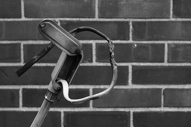 IMG_1363a
")
 IMG_5248-1
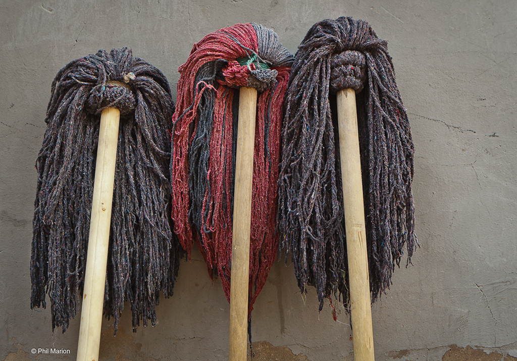


")


![[No title]](/data/xfmg/thumbnail/36/36393-86ce601930c671b92b6df002b7fcbd0b.jpg?1734168775)


![[No title]](/data/xfmg/thumbnail/37/37621-b86590cf53fc4001d12701ee3091029b.jpg?1734170745)


