Photos from a Farm (C&C please)

Lraccomando

TPF Noob!
Joined
May 31, 2010
Messages
44
Reaction score
0
Location
Salem, MA and Amherst, MA
Can others edit my Photos
Photos OK to edit
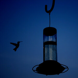
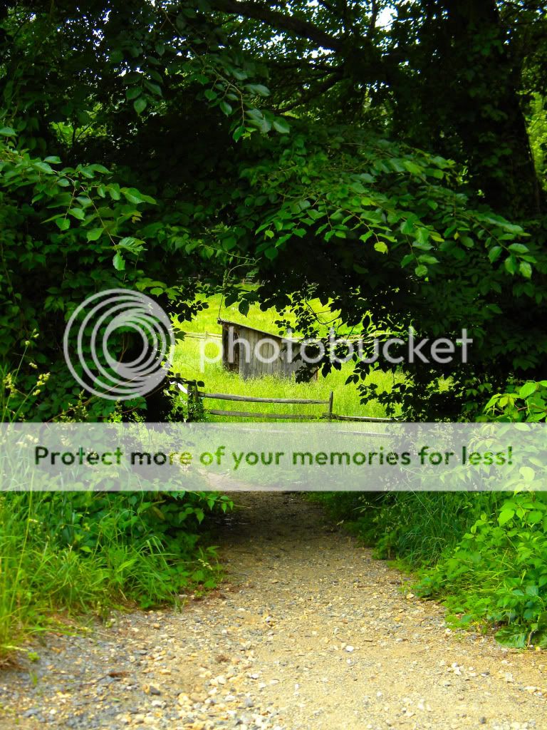
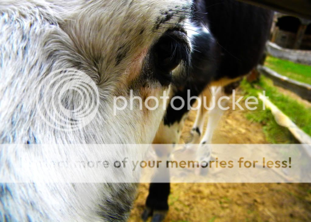
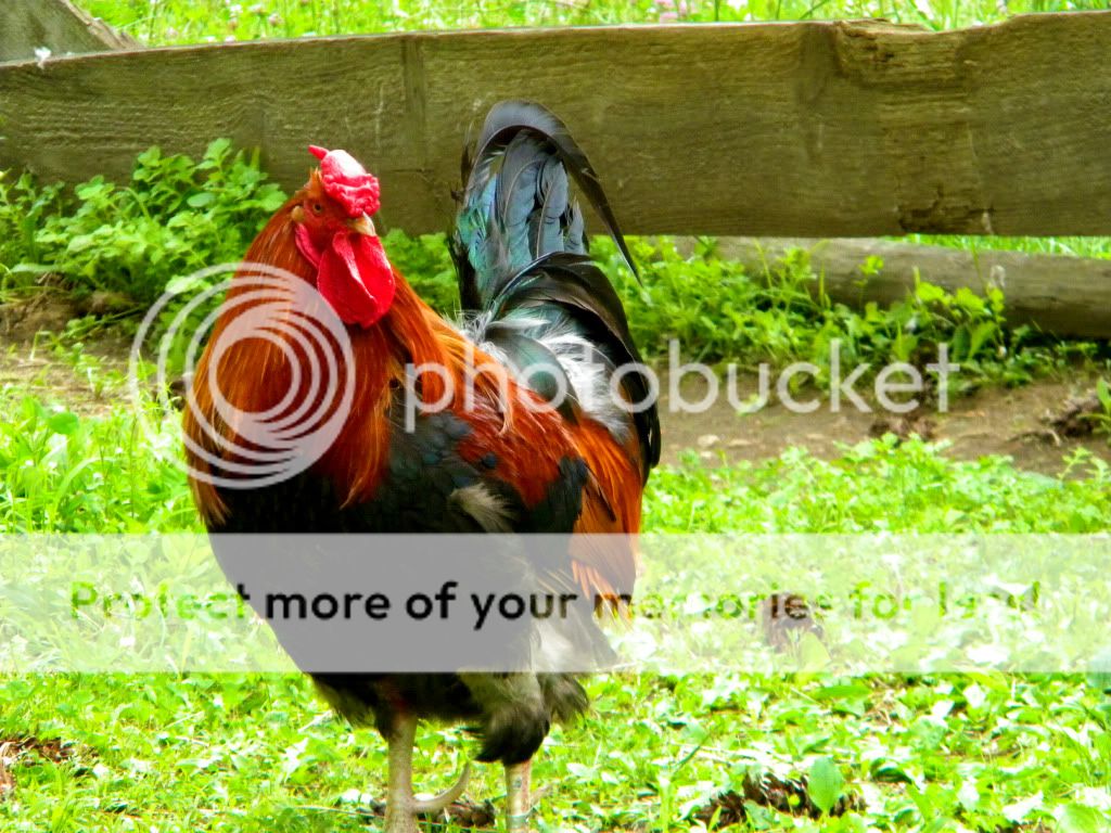
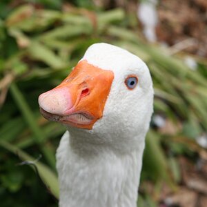
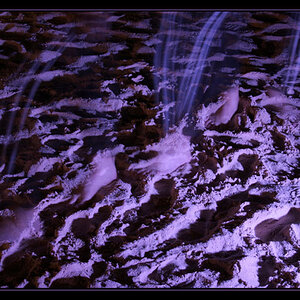
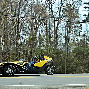
All photos taken with Nikon L100 ultra-zoom, PPed in photoshop CS5.

Please C&C if you have a chance :)

TunnelofGreen.jpg


SheepbytheRedHouse.jpg


Cow.jpg


Rooster.jpg


Thank You for taking the time to check out my pictures :)
 
I only like the first one. It would be better if you crop it closer to the circle. I think it would be a super fantastic picture
 
Thanks to both of you for the feedback!

And Bus_rider, I really like the tighter crop, makes it much more effective. Thank you!
 
I like #1 and #2 the most...

I was thinking... What if you went with a tighter crop on the first one?

TunnelofGreen.jpg

Ditto. I thought a tighter crop would work better as well. I like the edit
 
I think a tighter crop on the first one too, and crop to move the shed from the center region of the photo since off centered objects often looks better.

I almost edited a version, then saw Mark's (BuS_RiDeR), thats what I was thinking.
 
I said it first!!!! Where is my candy?
 
Thank you to everyone! :)

I am curious though, what is it about the other photos that you don't like. (Not that I disagree I'm just trying to get feedback on what not to do next time.)
 
It's not that we don't like them just that some pic move people more than others. I think the rooster shot would look great if u did some artsy ps edit, I think the pic of the feild and barn just needed a better focal point.... Like getting more personal w the scenry....the great old fence would be something to get close to....or getting up close and personal w the barn since they both have great character.
 
#2 i feel like there is no dominant object. Either get the one sheep or two and blur out the back ground a bit, or get the house.

#3 I think you need to include the mouth too for this kind of shot

#4 DOF too deep
 
Thank you to everyone! :)

I am curious though, what is it about the other photos that you don't like. (Not that I disagree I'm just trying to get feedback on what not to do next time.)

Some thoughts/suggestions, others may see some different things...

The second one I think there is just too much competing in the image. I think simplicity here. More of the barn and maybe one or two lambs, or focus on a group of the lambs with a small portion of the fence and/or barn in the background.

I think the cow is in a little too close, my eyes are taken down to the feet and the dirt. If you were going for the eye, then maybe some fill light, and a portrait orientation to have more of the cow in the shot, and less of the background.

The rooster is dark, the background is very bright so I would have used flash here to bring the light level of the rooster closer to the background. That way the subject would be lit better and the background would not bee so bright (overexposed). I would probably include the feet, and also try this one in portrait orientation. Although, with feet included landscape orientation may work too, especially since the rooster is looking off to one direction (good job not sticking the rooster smack dab in the center, images are more interesting like this if you leave space to the direction the subject is looking). I would have tried both portrait and landscape orientations and decided at the scene.
 
It's not that we don't like them just that some pic move people more than others. I think the rooster shot would look great if u did some artsy ps edit, I think the pic of the feild and barn just needed a better focal point.... Like getting more personal w the scenry....the great old fence would be something to get close to....or getting up close and personal w the barn since they both have great character.

Thank you, I suppose "not like" was the wrong term, i meant more like, what can i do to make these better, which is exactly what you gave, thank you for the feedback :)
 
A bit to much saturation in all of them.

#2 could stand to be straightened. par tof why #2 is getting panned is it looks like 2 images in one frame, 1/2 and 1/2.

#3 isn't working because the side of the cow is to dark.

#4 is to static.

#1 is the best artistically but can use some post processing and BuS RiDeR's crop is about spot on.
 
Geez, late to the party and all the good critique is already taken...

1. I agree with the comments about a tighter crop working on this one, but I also like it as-is; I get sort of a 'Secret Garden'feeling from it. I do think though that the foliage could use a little brightening. Perhaps some additional levels/curves adjustments?

2. I think a slightly different shooting position to eliminate that little patch of bright, white sky, upper-left. My eye keeps going straight there. This one definitely needs leveling and a perspective correction wouldn't go amiss either.

3. Sorry, nothing here. To be honest I had to look at it three times before I even saw the cow's eye! The idea was good, but the execution should have been more side-on to eliminate all of the distracting lines, especialy the fence and the dark fur in the background.

4. Again, as with the cow, a little too 'head on' and not enough profile for my taste. As well, this is a situation where you really want to try and use selective focus to make the subject stand out from the background. Also, be sure that you don't lose little bits of the subject, in this case the feet. If you need to crop body parts, whether human or animal, the general rule is be bold; this looks more like you just weren't paying quite enough attention.

Just my $00.02 worth - your mileage may vary.

~John
 

Most reactions

Back
Top