photoshoot in the library (C&C appreciated)

xzyragon

No longer a newbie, moving up!
Joined
Apr 9, 2014
Messages
330
Reaction score
125
Location
La Jolla, CA
Website
www.facebook.com
Can others edit my Photos
Photos OK to edit
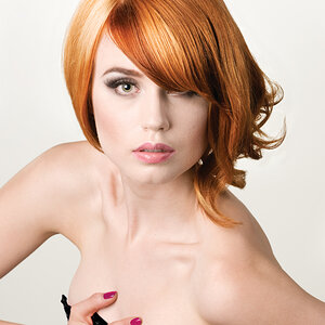
A friend wanted to do a photoshoot at the library on campus. Got to try out a couple different things i've been wanting to play with, like putting her against a bright window, then over-exposing the background and getting her exposure right to simulate an all-white background.

Anyways, I'm still learning on all my portrait shoots, so any C&C from you guys is extremely helpful (from in-camera work to post stuff).

IMG_6421 by christophercoxphoto, on Flickr

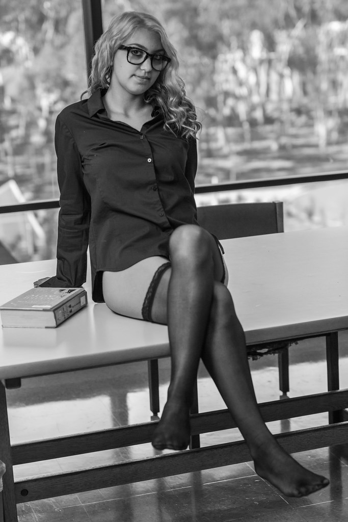
IMG_6351 by christophercoxphoto, on Flickr

IMG_6358 by christophercoxphoto, on Flickr
 
Seem rather.... Under-dressed... For a library, don't they?
 
Seem rather.... Under-dressed... For a library, don't they?

What? I thought this was normal library attire?

She wanted to do a "sexy nerd" themed shoot, which eventually turned into this, but I can't complain when girls take off their clothes. This was also the first "scantily clad" shoot i've done, so it was a complete learning experience for me.
 
Just dealing with the first shot. The most damaging thing is the washed out skin color of her face as compared to the rest of her. I rather like the 2d one. The third not so much, cropping maybe?
 
Just dealing with the first shot. The most damaging thing is the washed out skin color of her face as compared to the rest of her. I rather like the 2d one. The third not so much, cropping maybe?

she wasn't the greatest at makeup, but I'll try and go in and add some color to her face. And do you just not like the empty space in the third?
 
What's with the artifacting in the glasses? Especially in #3 - it looks like they're made of Lego blocks!
 
What's with the artifacting in the glasses? Especially in #3 - it looks like they're made of Lego blocks!

they were!
:lol: Fair enough... Probably not the best choice for this shoot since it really looks like some sort of processing "issue". With respect to the overall C&C, I think your lights needed a little tweaking in #1; her face is a totally different colour than her abdomen. Bringing your lights in closer and lowering their output, and perhaps using larger modifiers would have helped. What was your lighting setup in this one?

1 off camera flash in a 42" umbrella / softbox type thing. Definitely above the model, and fairly close. Looking back at the unedited pictures, she did have an unusually pale face though. Probably why I favored black and white for most of her shots. I'll see if I can go back in post and add some color.
 
Just dealing with the first shot. The most damaging thing is the washed out skin color of her face as compared to the rest of her. I rather like the 2d one. The third not so much, cropping maybe?

she wasn't the greatest at makeup, but I'll try and go in and add some color to her face. And do you just not like the empty space in the third?


Can't put my finger on it exactly, just isn't 'right' to me. Maybe the perfect vertical alignment? Or the shallow DoF? The theme and subject are definitely worth a 2d run through I think. Biggy is the lighting in that first one, I have serious doubts that any post could correct that satisfactorily. Like I said, if the model is willing I would definitely have another go at this.
 
I thought you did a good job on the first shot, simulating the white seamless by over-exposing the background...I've done that myself, and think you did a great job on that. If anything, shot #2 is the one with the serious lighting issue, and also has kind of a camera height/camera tilt issue going on. Shot #3 has decent lighting, looks like overhead fluorescent panel lighting.
 
I thought you did a good job on the first shot, simulating the white seamless by over-exposing the background...I've done that myself, and think you did a great job on that. If anything, shot #2 is the one with the serious lighting issue, and also has kind of a camera height/camera tilt issue going on. Shot #3 has decent lighting, looks like overhead fluorescent panel lighting.

I don't like how the background is distracting away from her / how she is darker than the brighter background in #2. I'm also not sure if the tilt adds or detracts from the image, but it's definitely tilted.
 

Most reactions

New Topics

Back
Top